drawing
RHYTHM & REPETITION
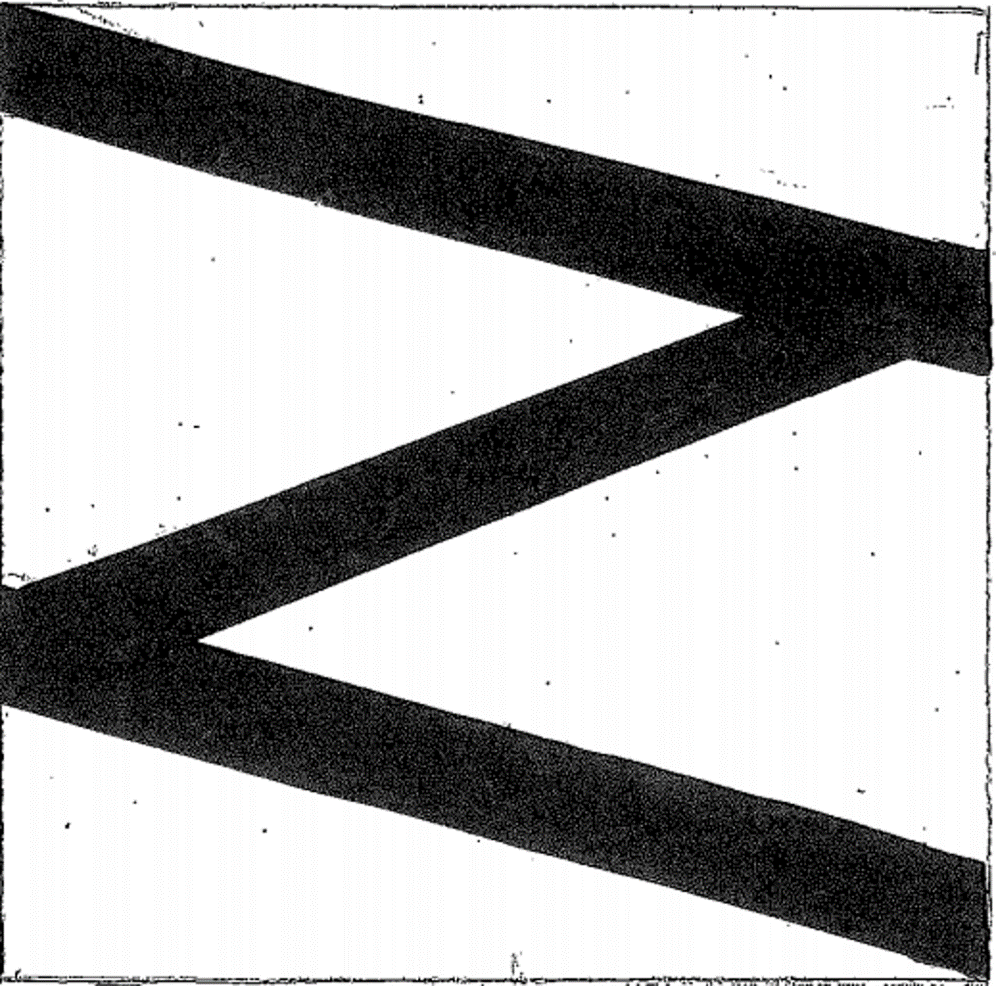
BALANCE
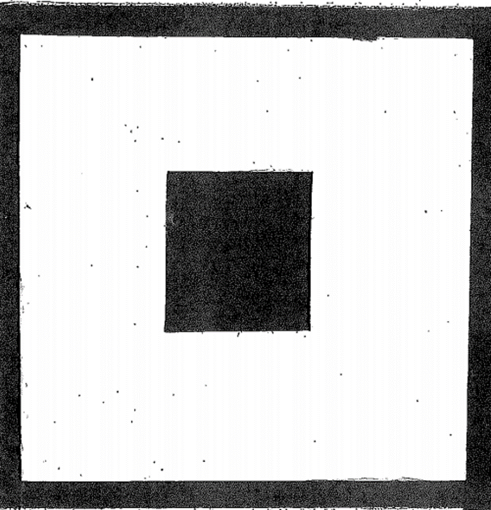
EMPHASIS
CONTRAST
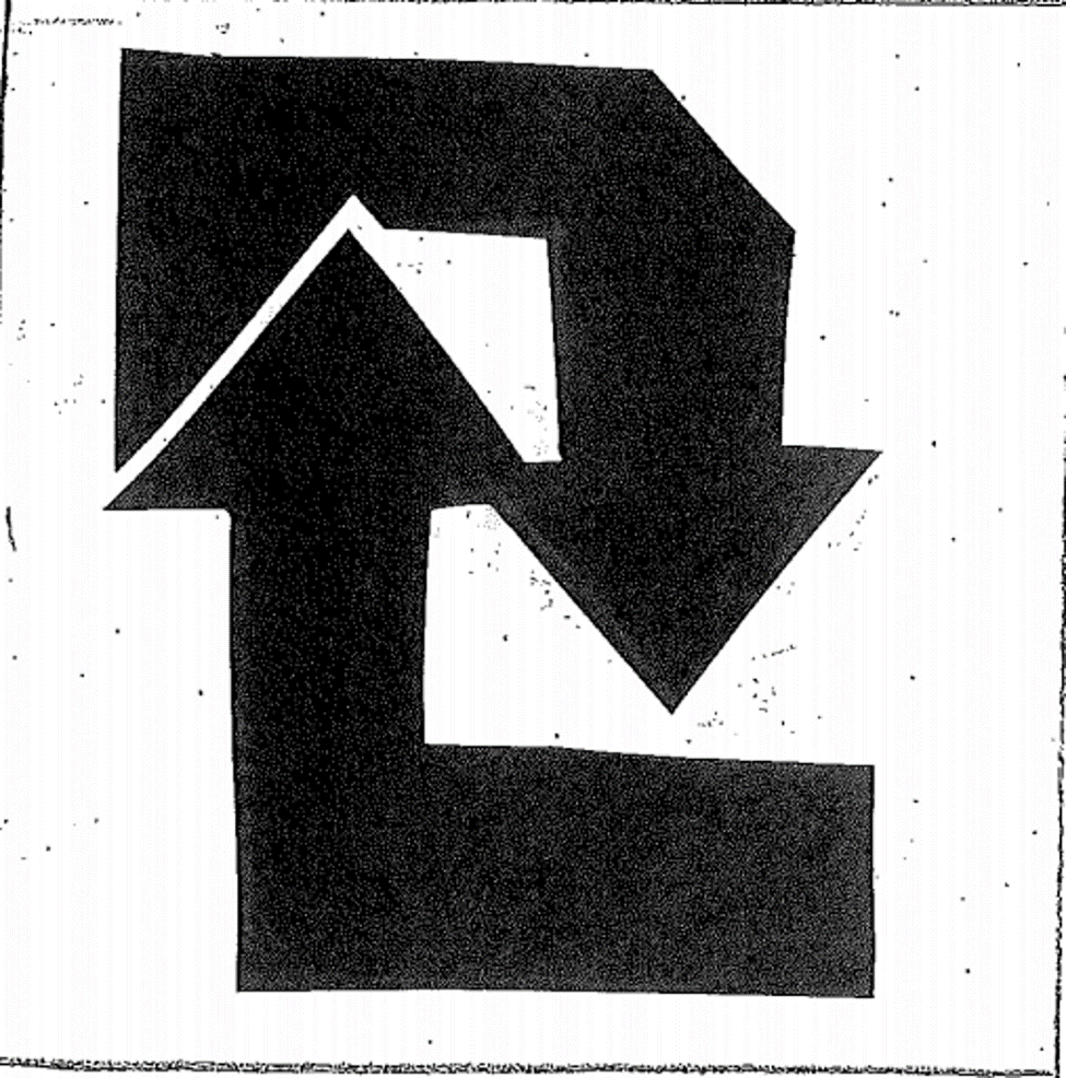
movement
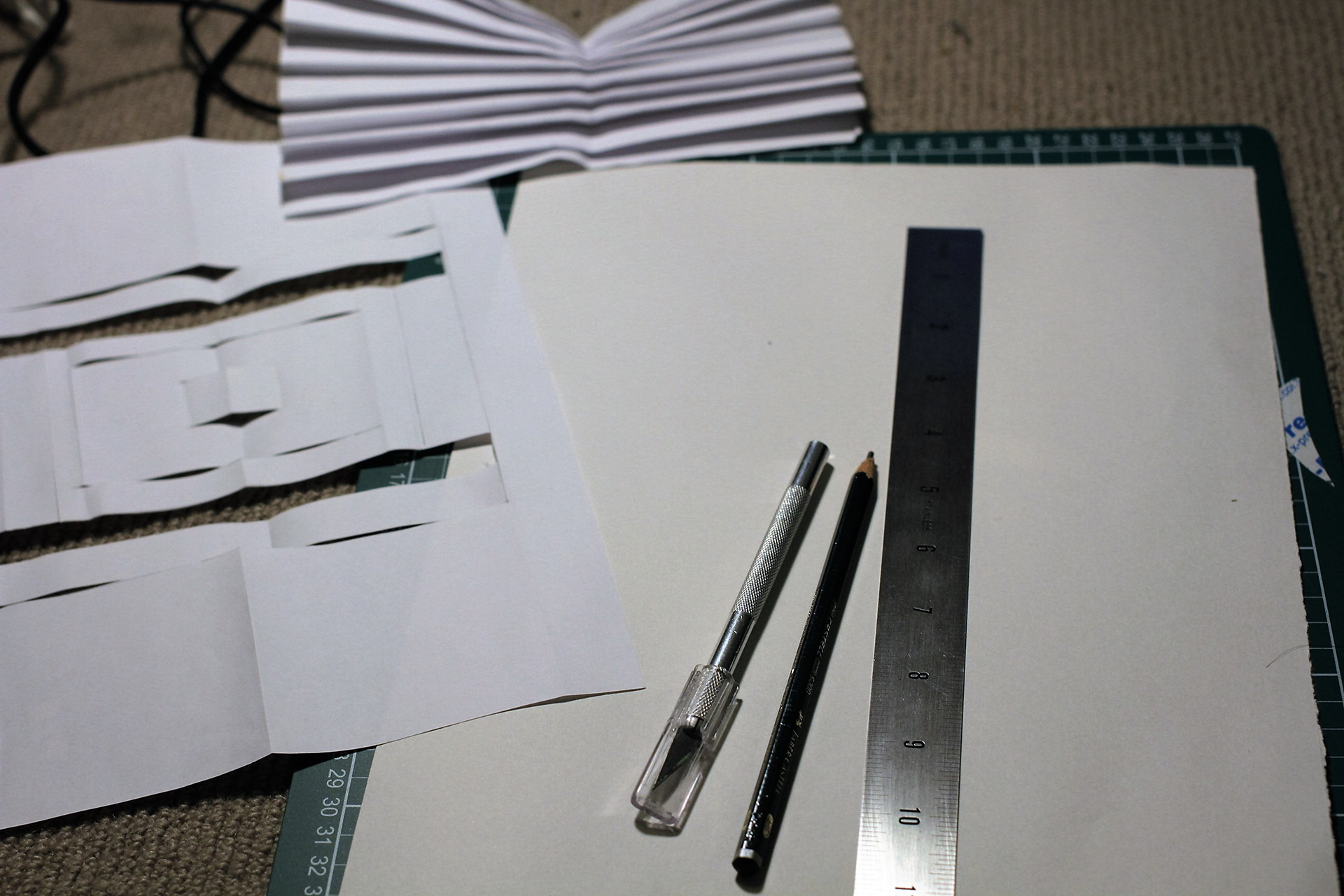
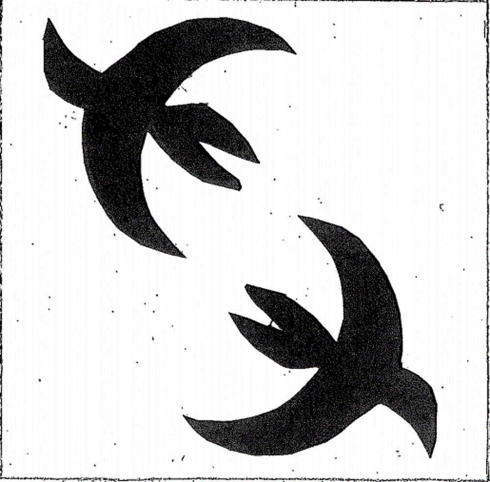
PAPER-CUTTING
CONTRAST
REPETITION
movement
BALANCE
emphasis
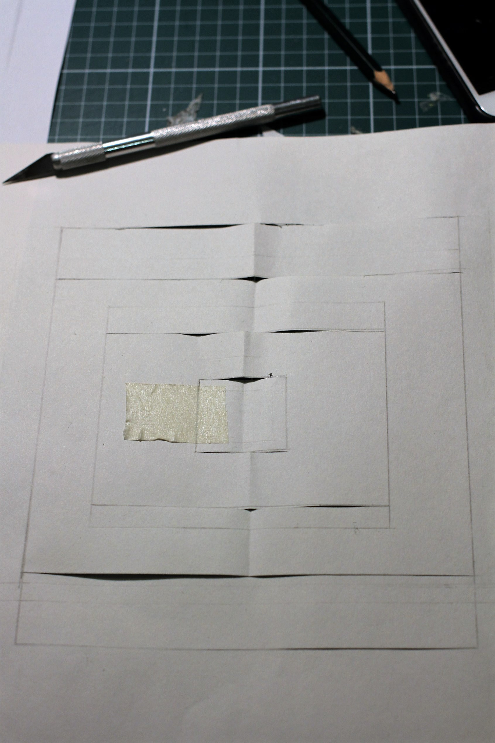
PAPER MODEL
MOVEMENT
balance
RHYTHM & Repetition
emphasis
contrast
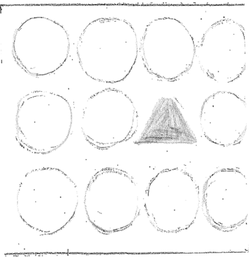
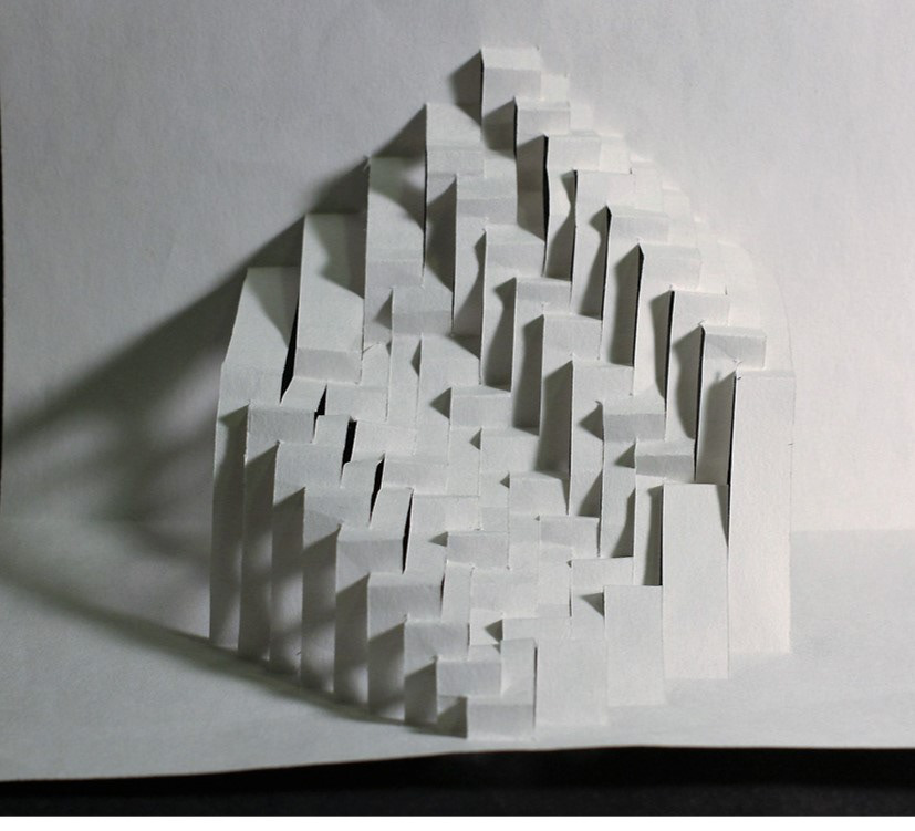
5 FINAL 3D STUDIES
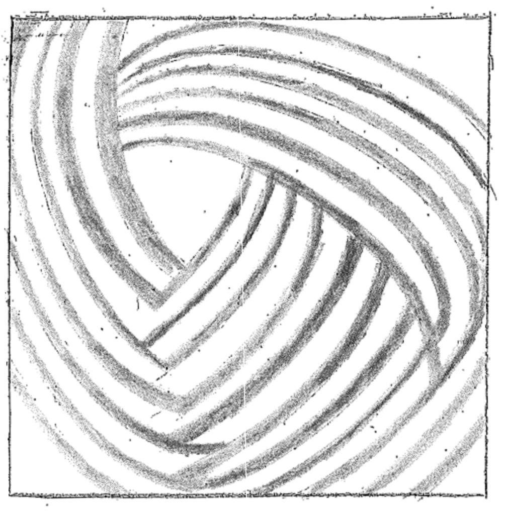
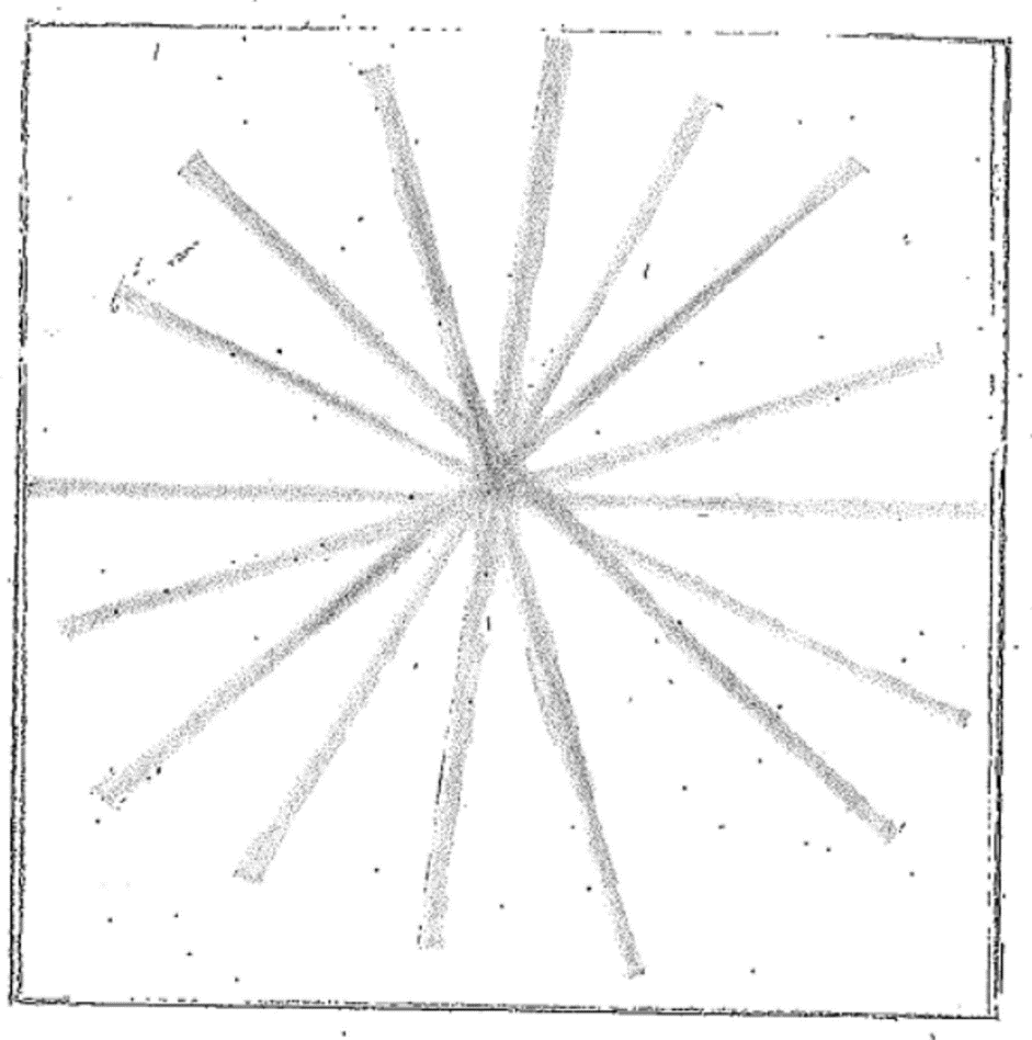
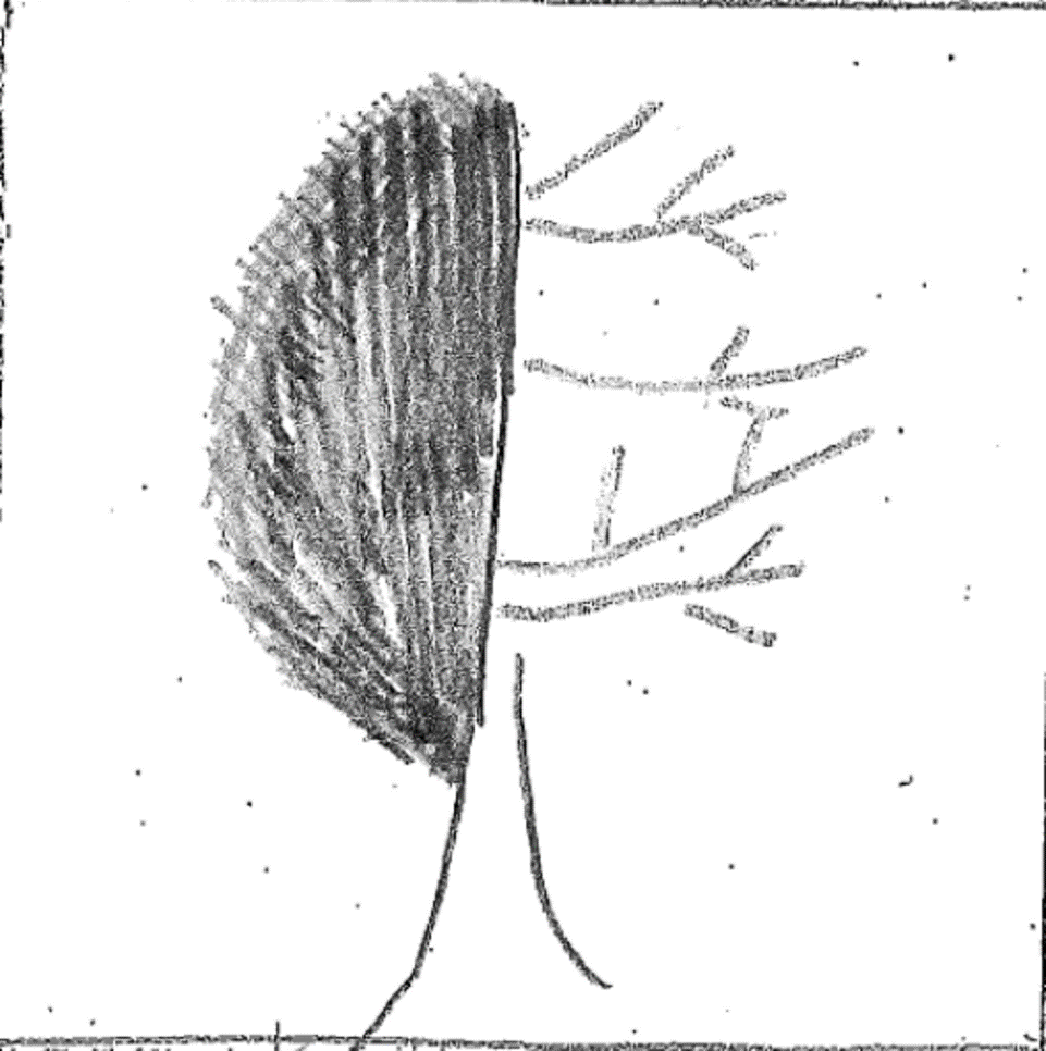
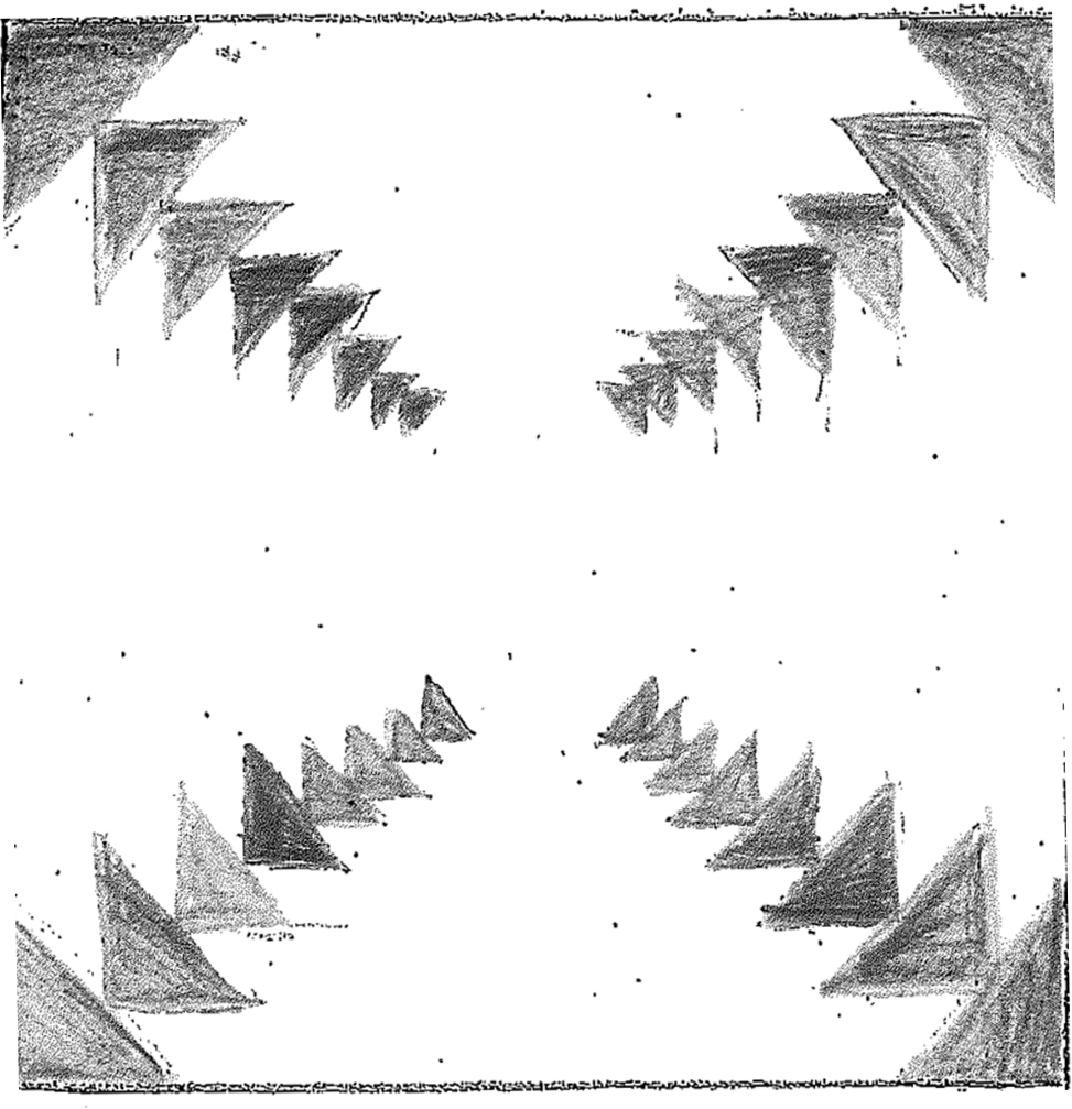
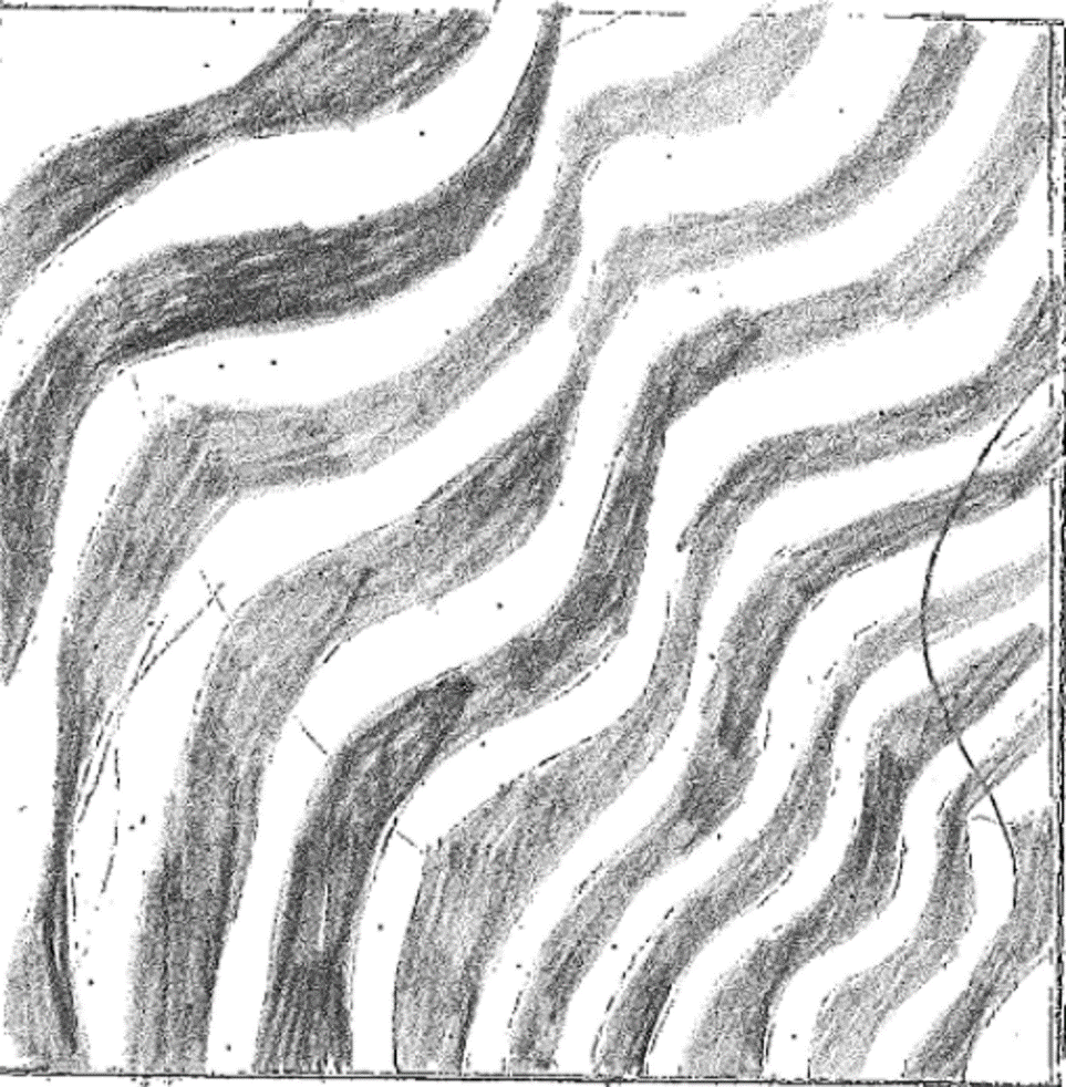
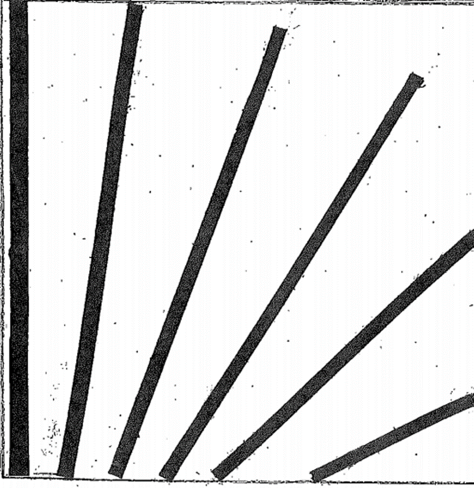
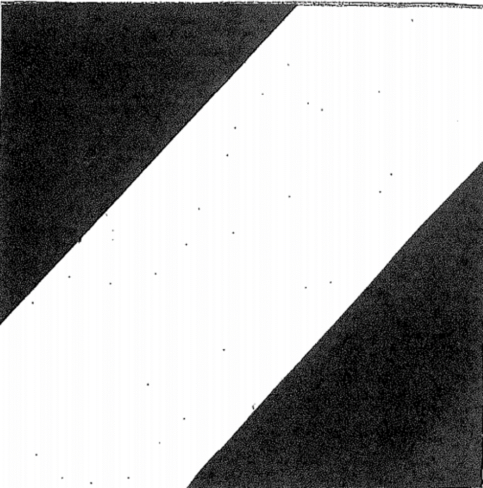
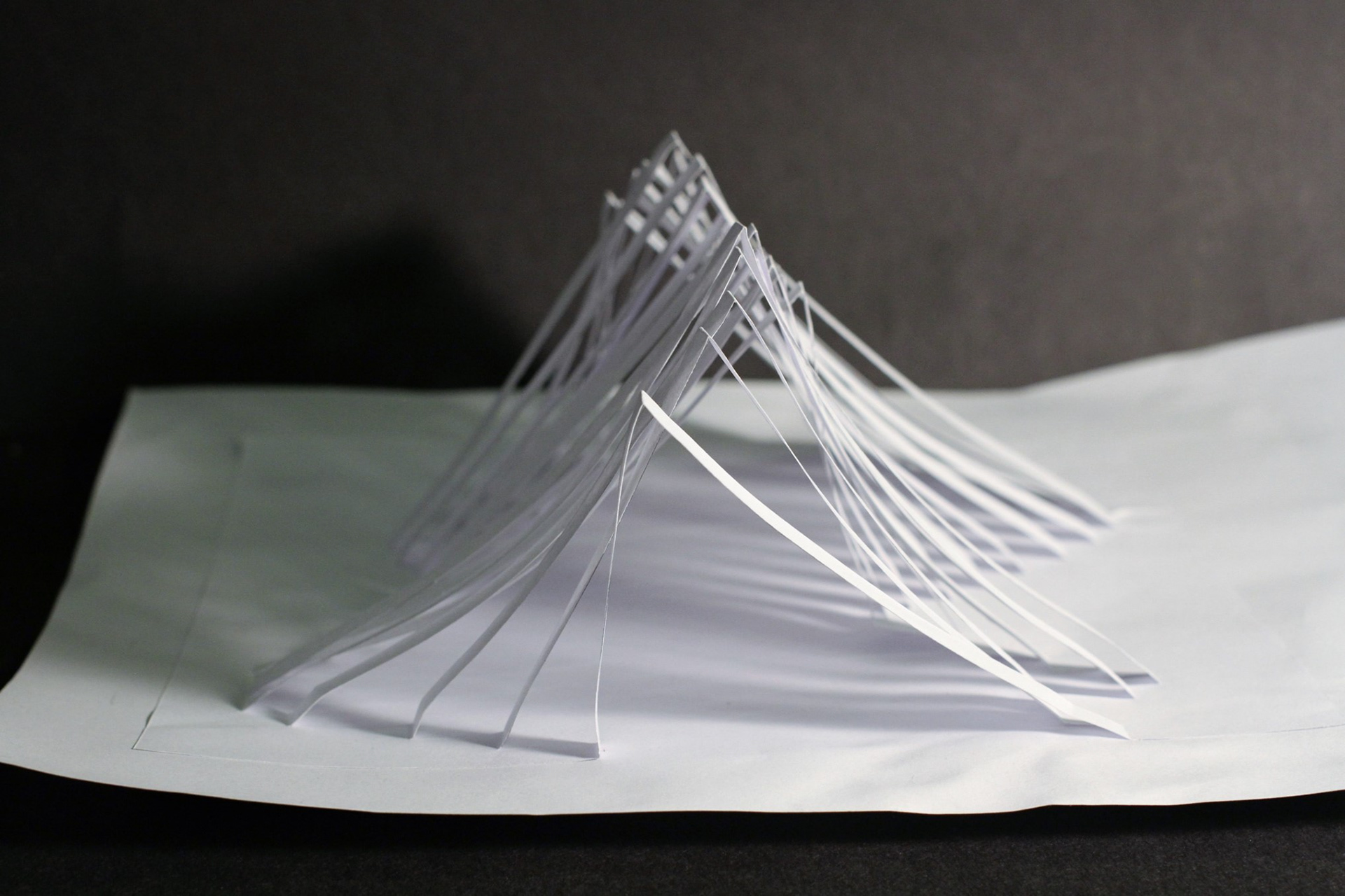
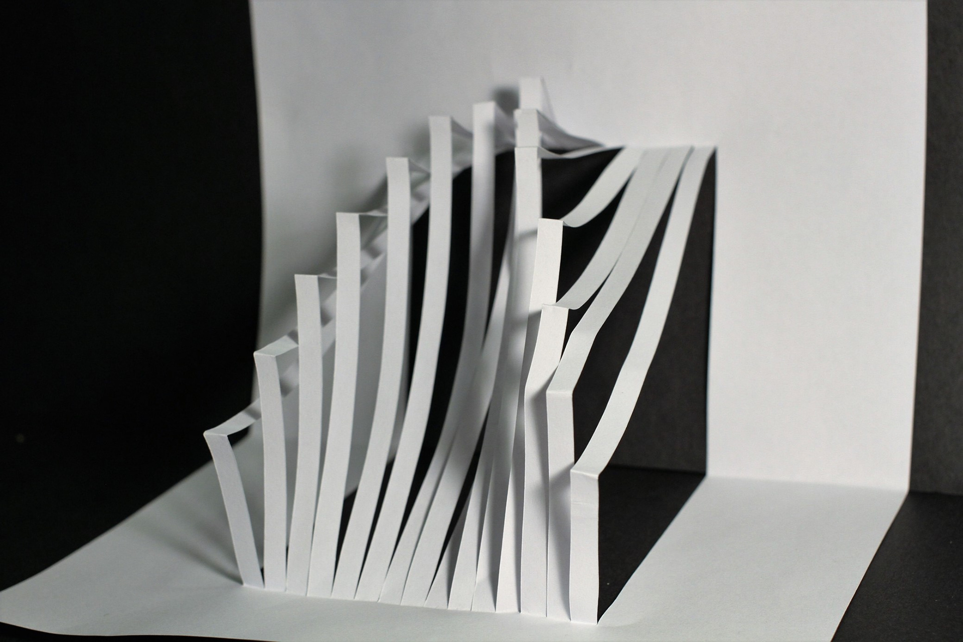
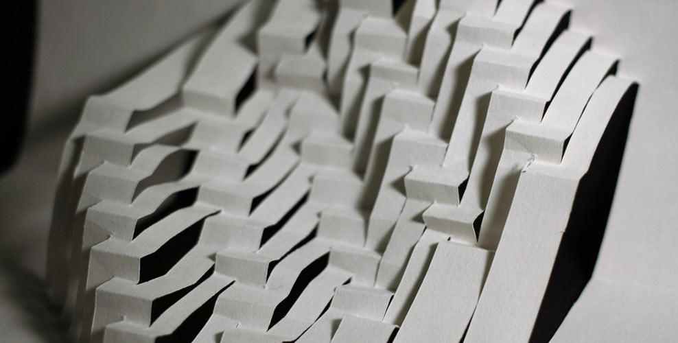
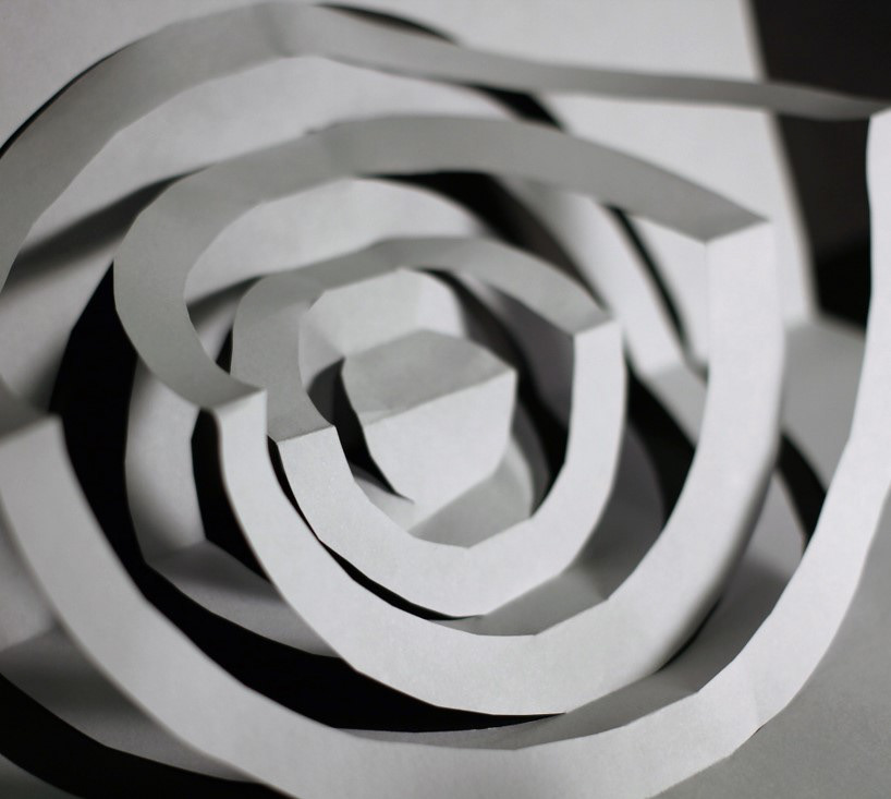
movement
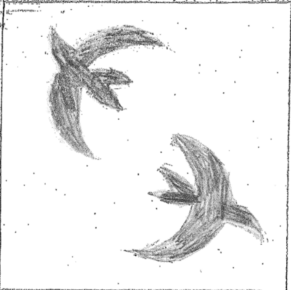
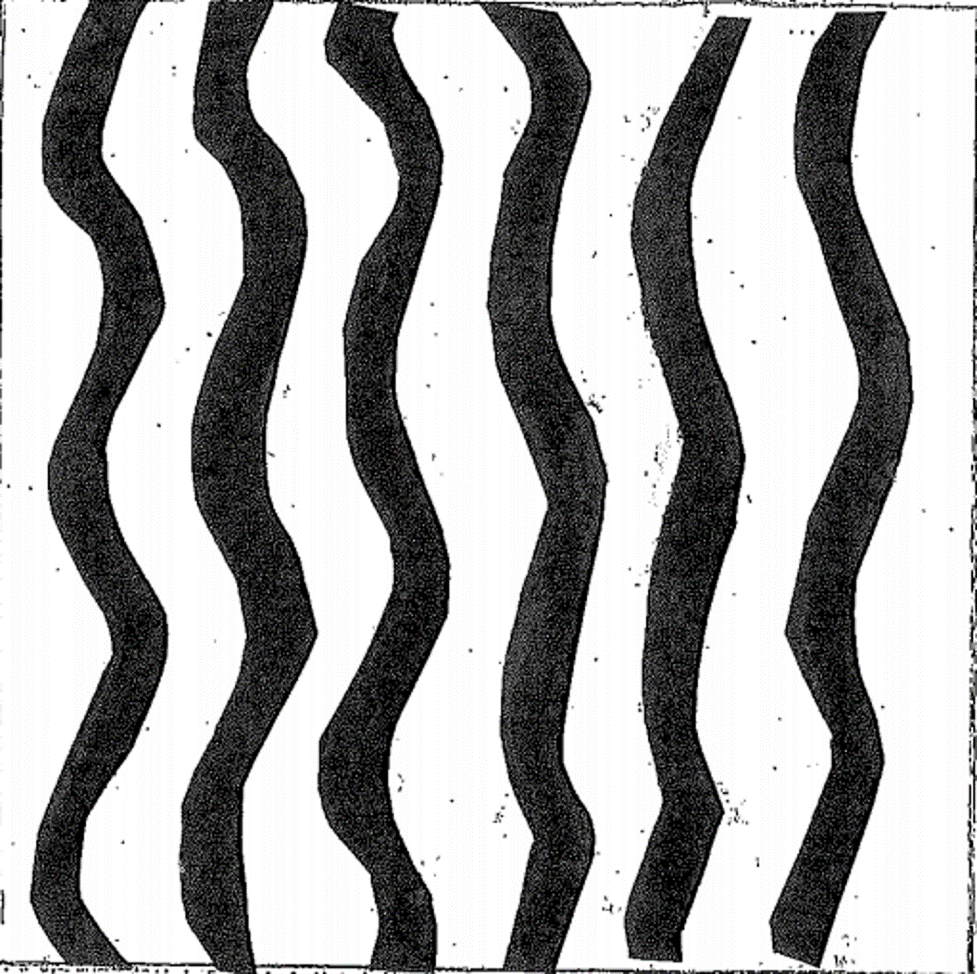
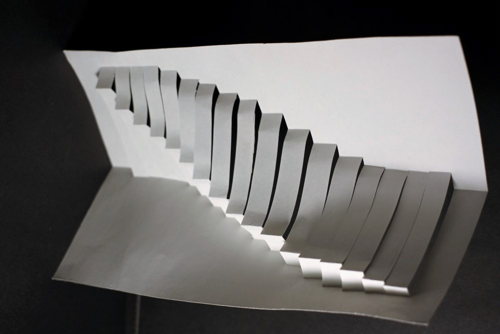
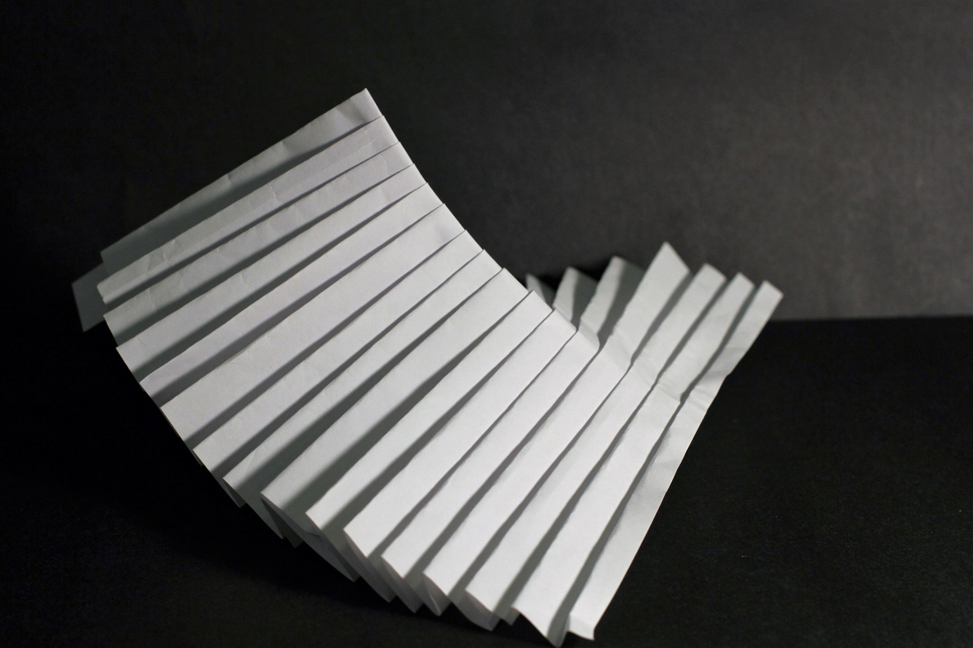
Movement show from a specific time and place. An art include certain motion, the artwork itself moves in some way. Or it may combine the illusion of, or implied movement. The physical element of movement is part of certain designed objects;
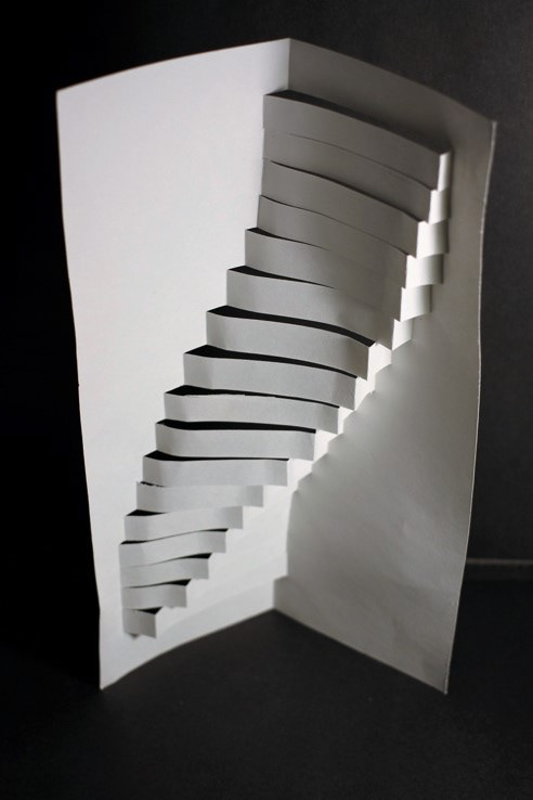
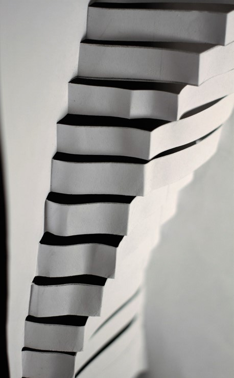
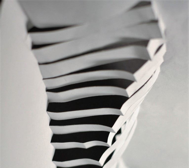
The picture shows movement principle design. this design like sea wave. Recurrence of elements with tilde, and high and low lines, lines is same but The direction of the fold is different. Fold a paper, create a movement feeling.
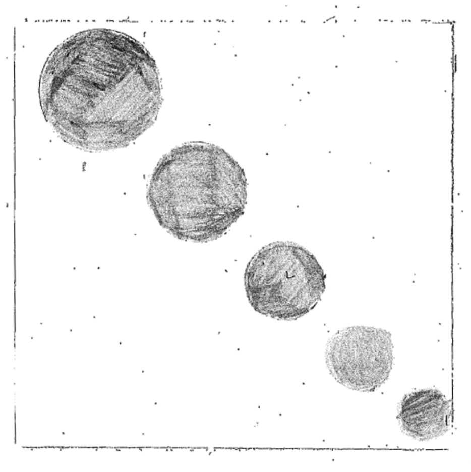
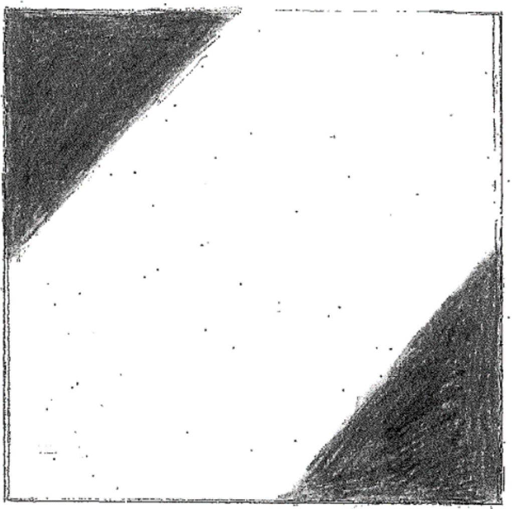
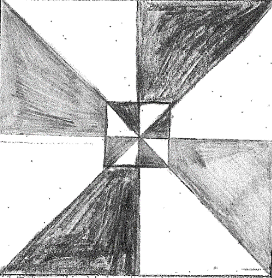
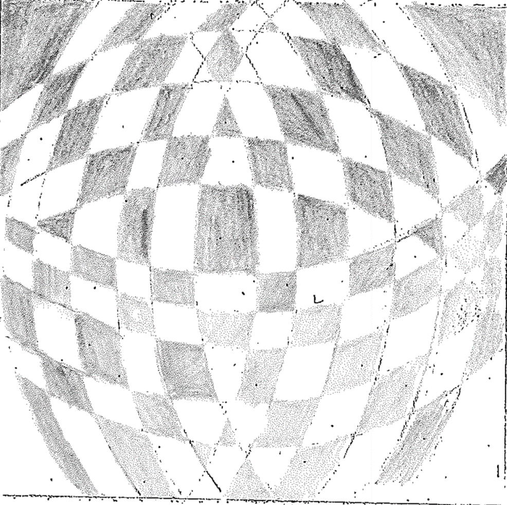
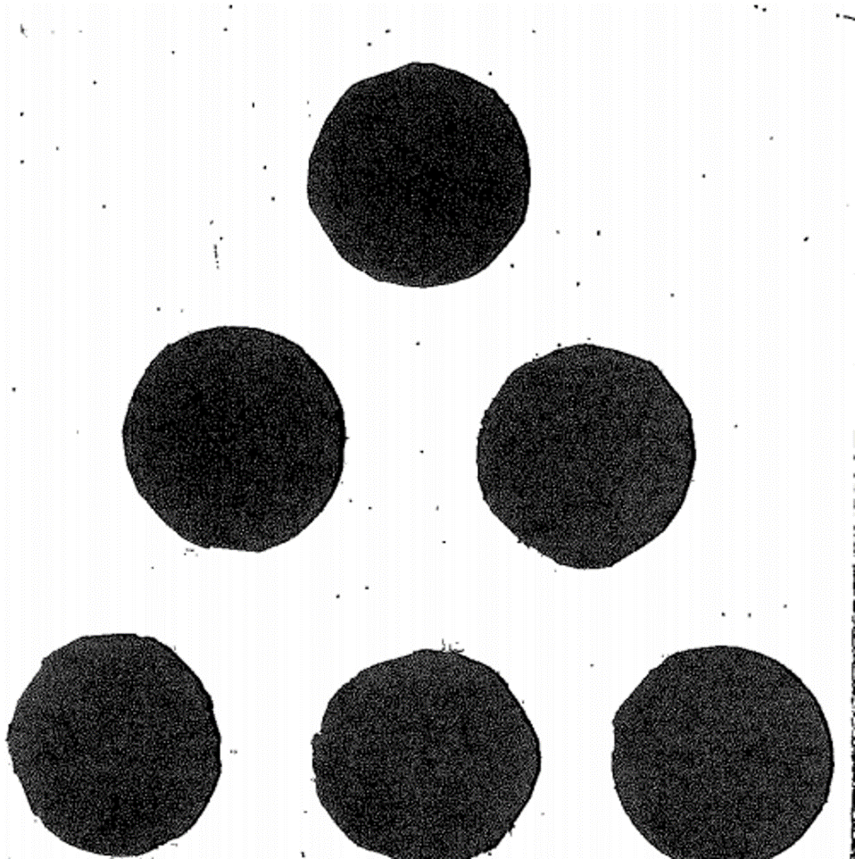
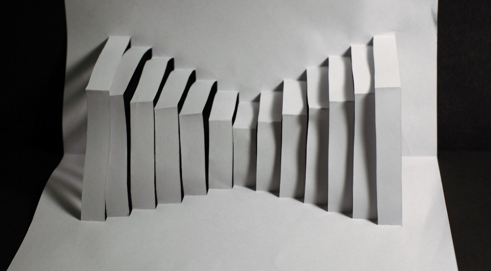
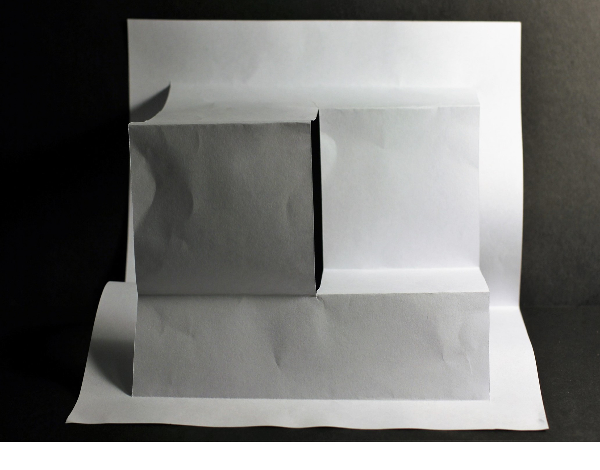
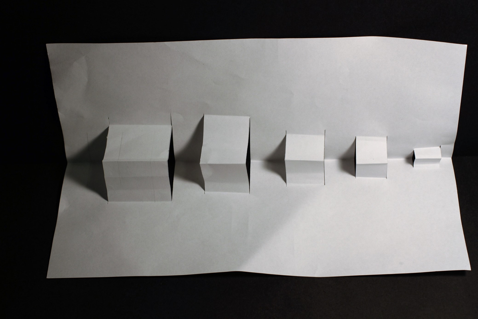
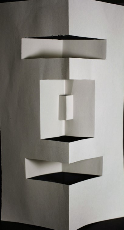
balance
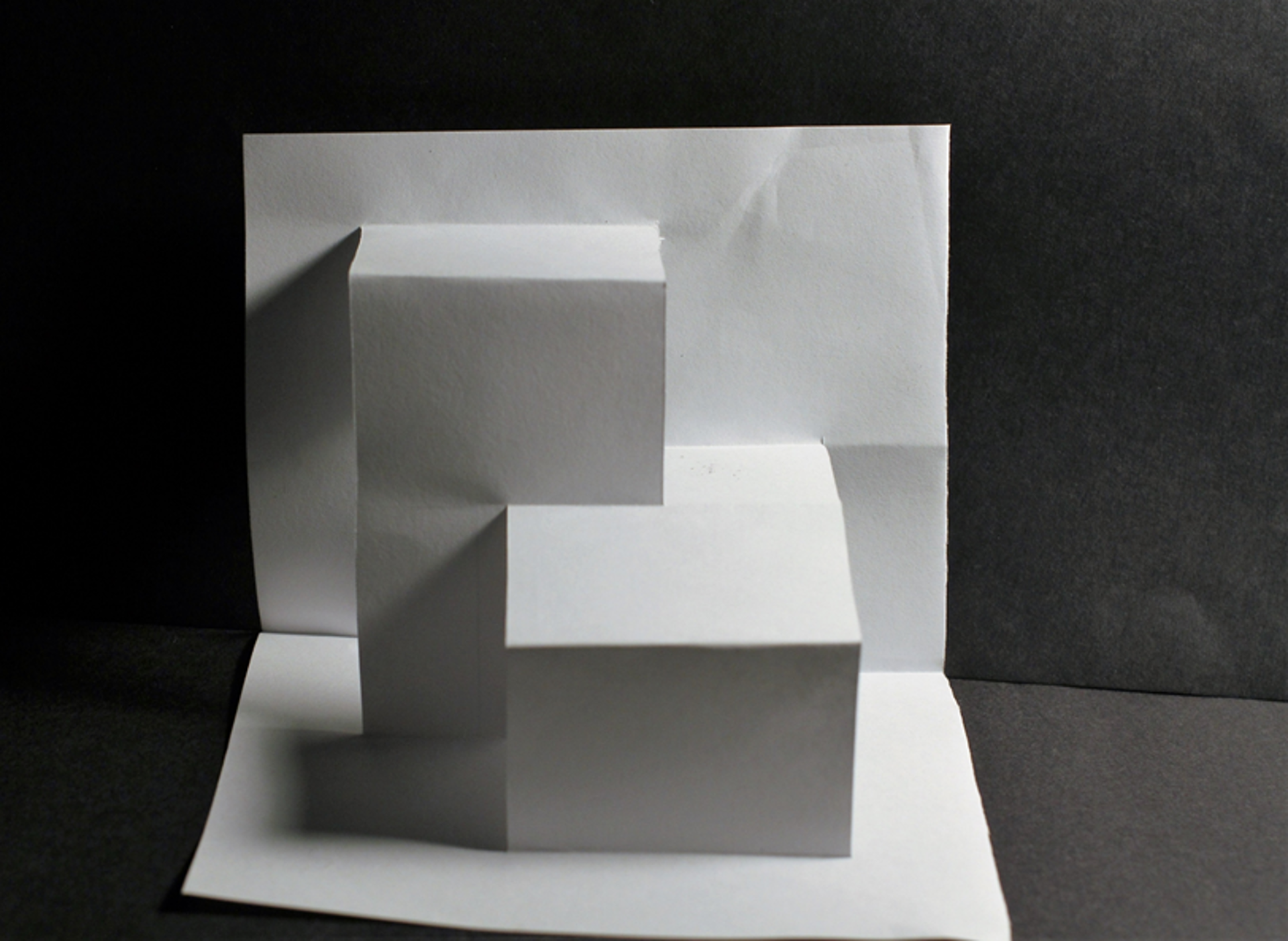
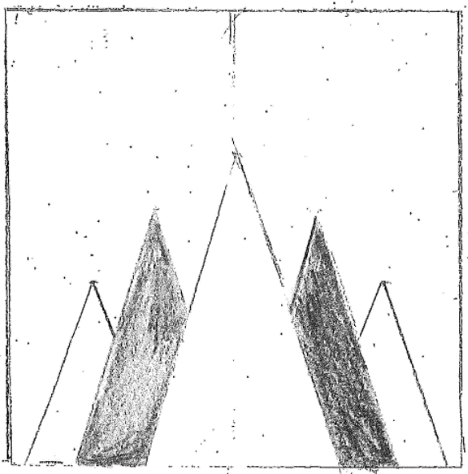
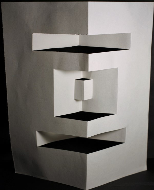
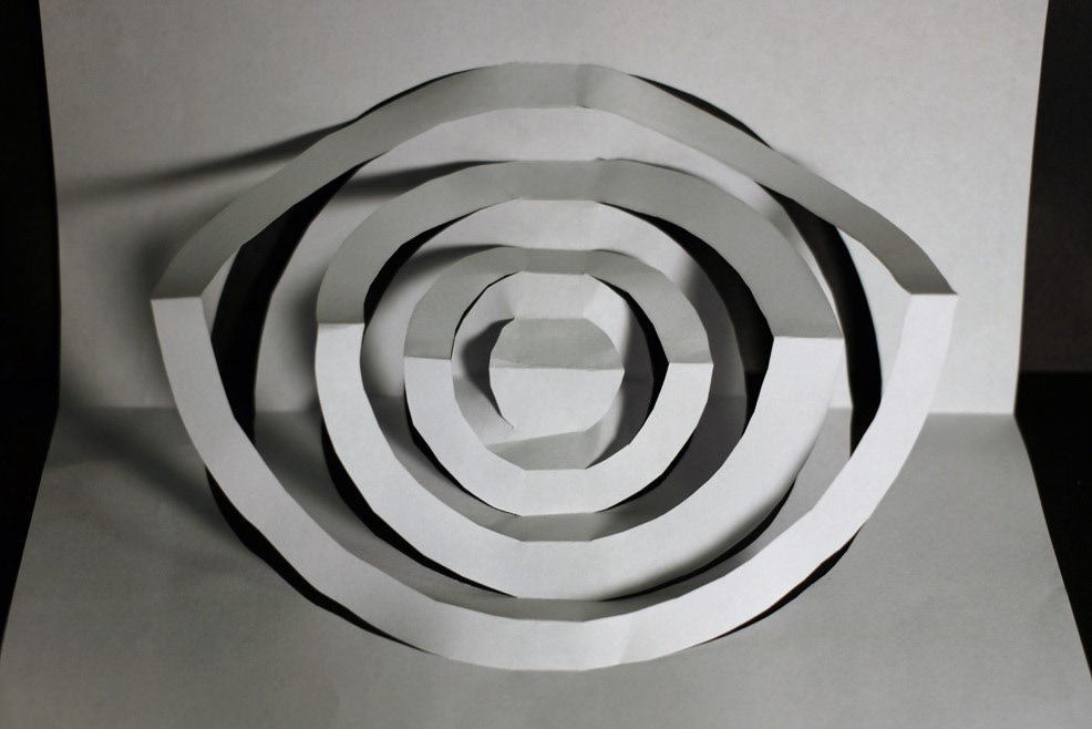
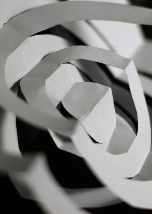
Balance is a common art expression, a basic principle of art. To be the balanced distribution of the “visual weights” of forms and colors. when the parts of an artwork seem to balance each other. Imbalance gives us an unsettled feeling.
In this design, I used area element. One high and one low cuboid, one in left, and one in right. They are two same size cuboid. Give us “visual weights” feeling. from the middle point, can form balance from two different points.
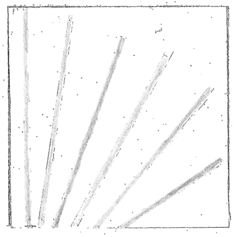
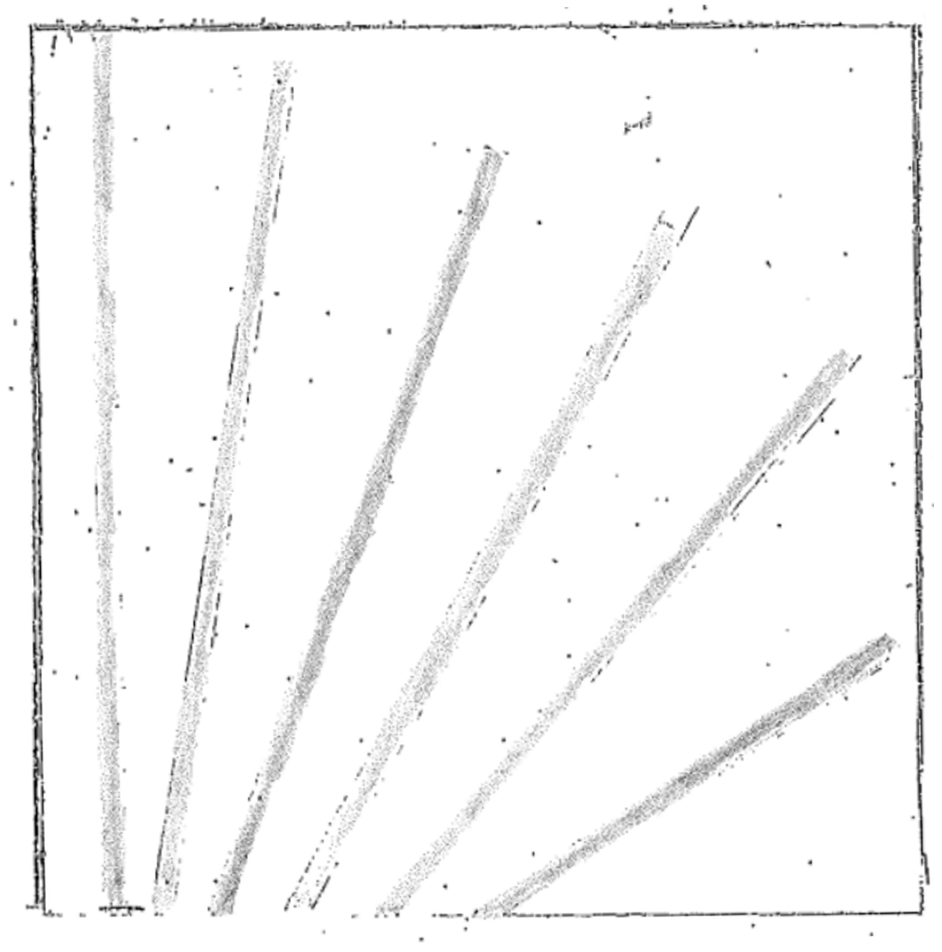
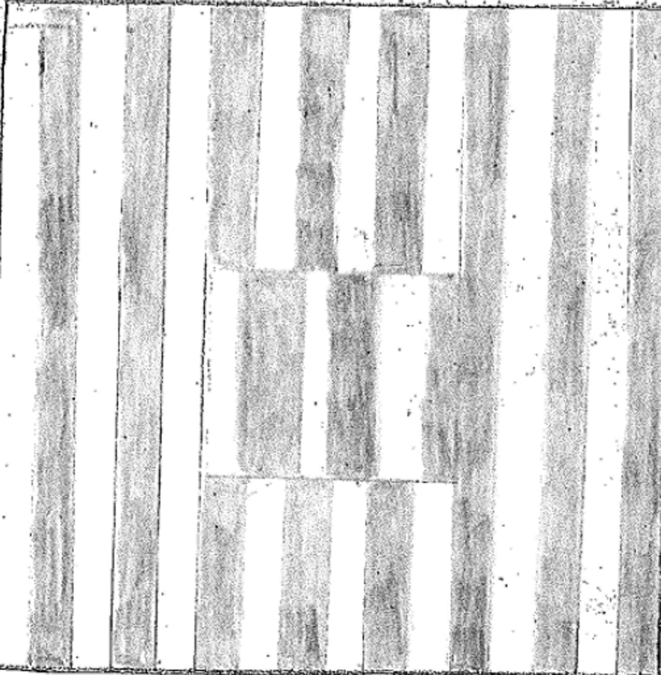
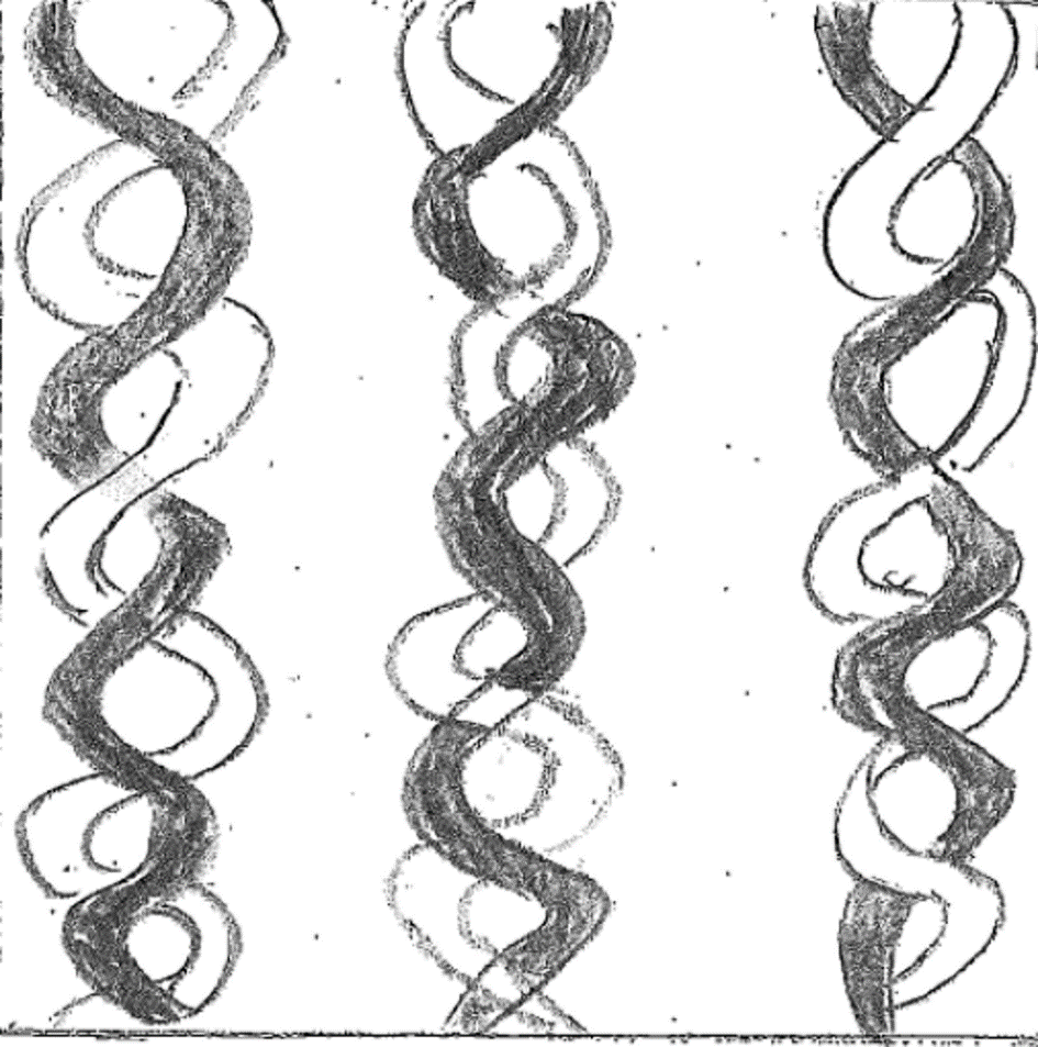
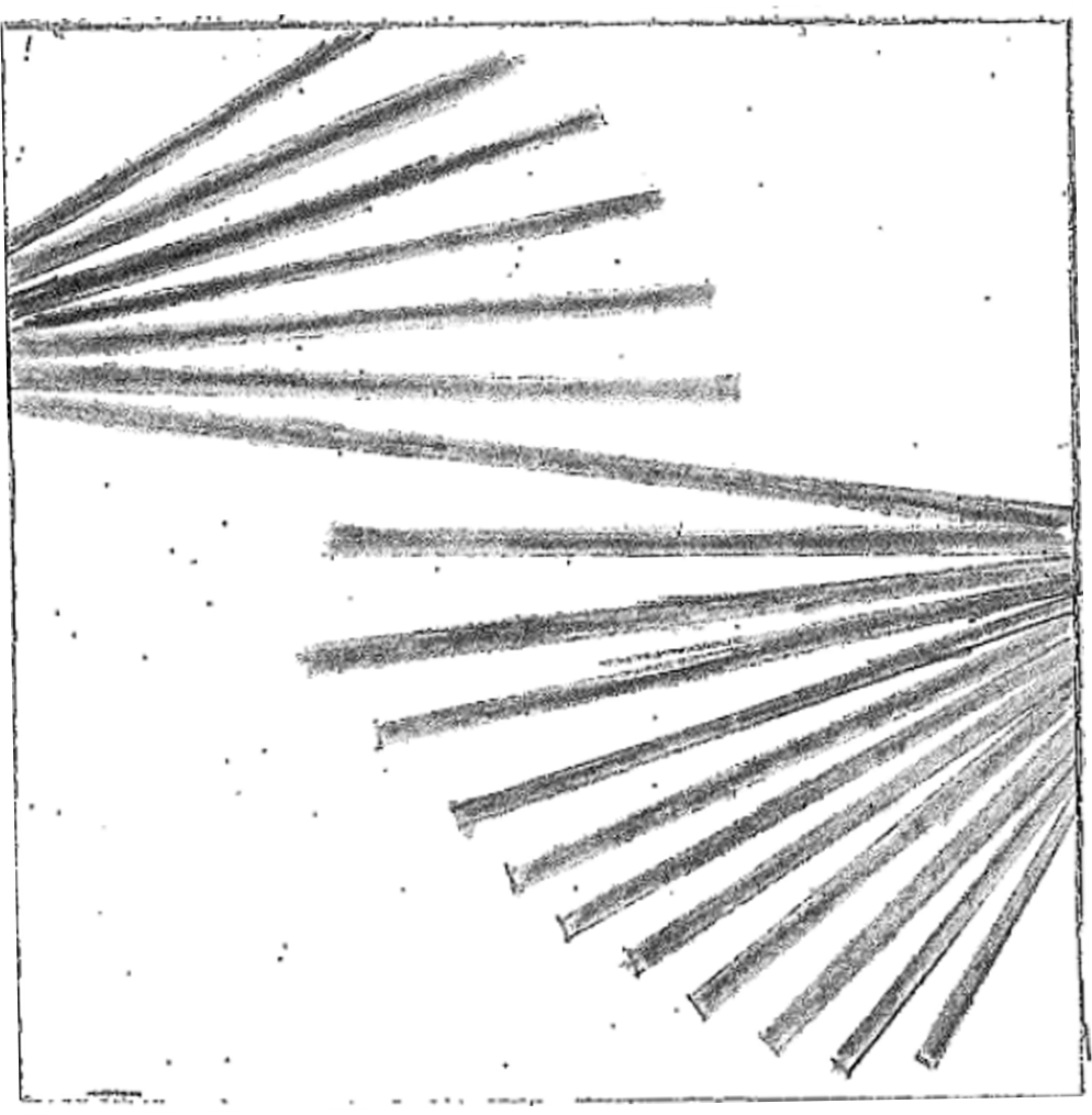
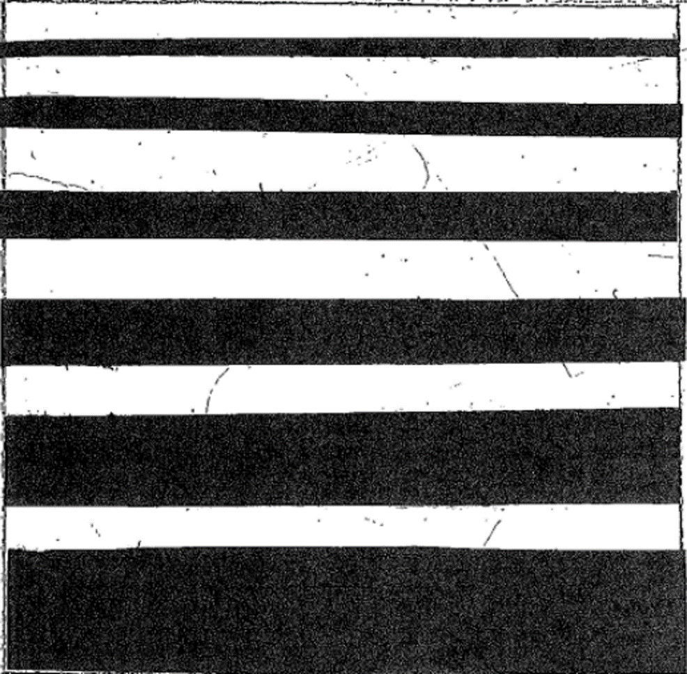
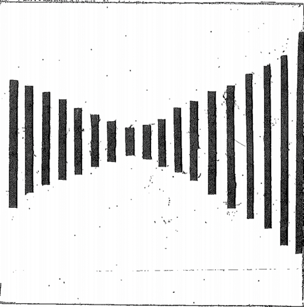
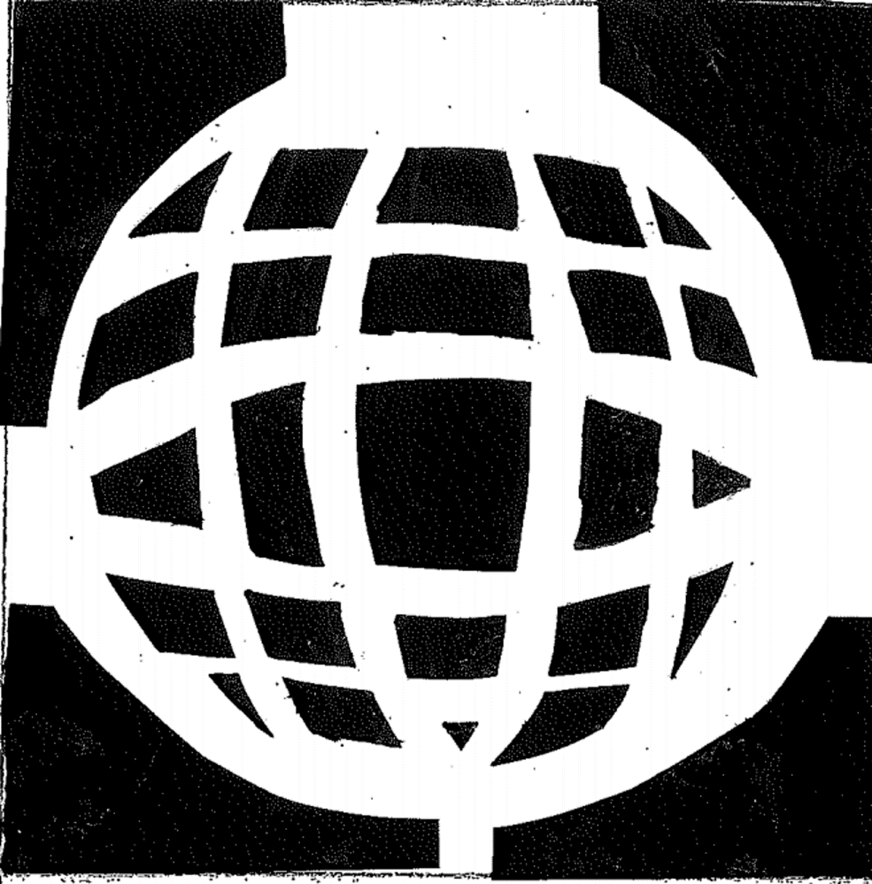
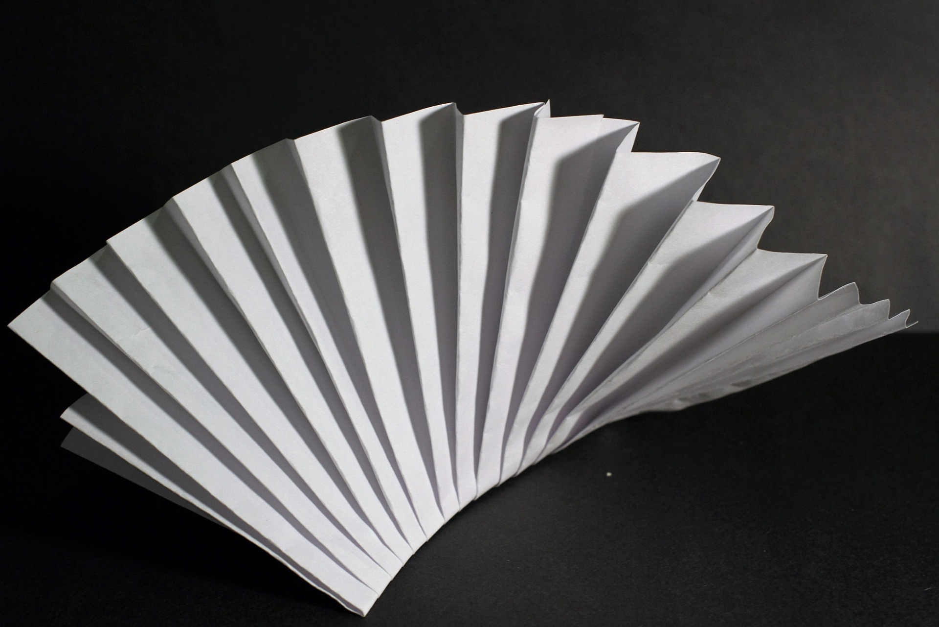
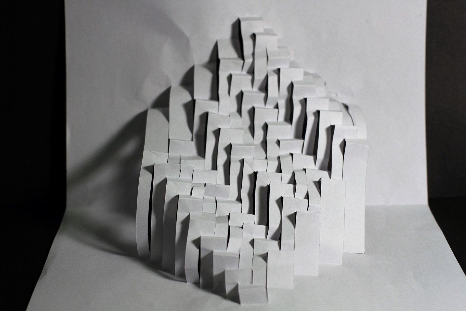
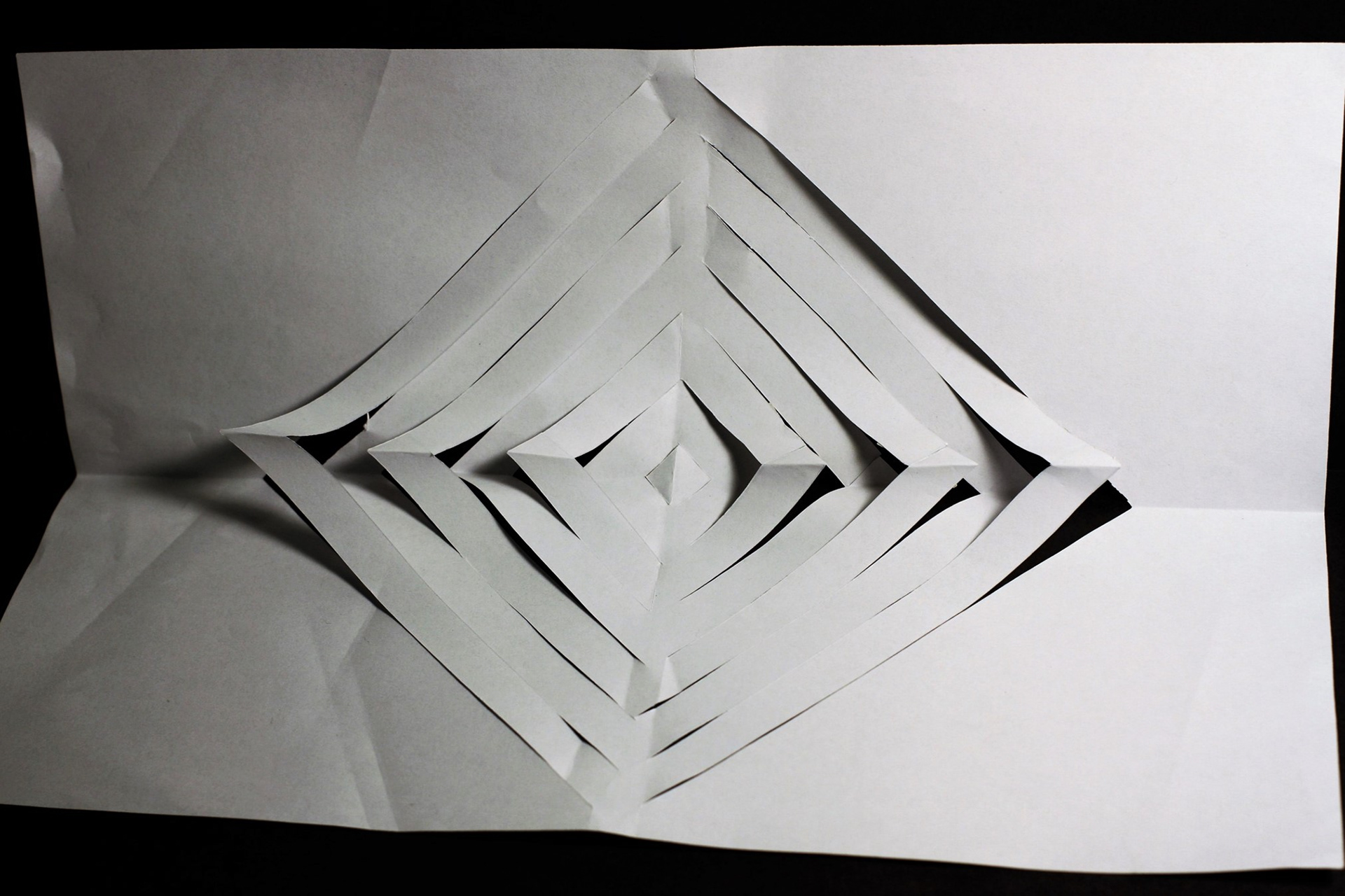
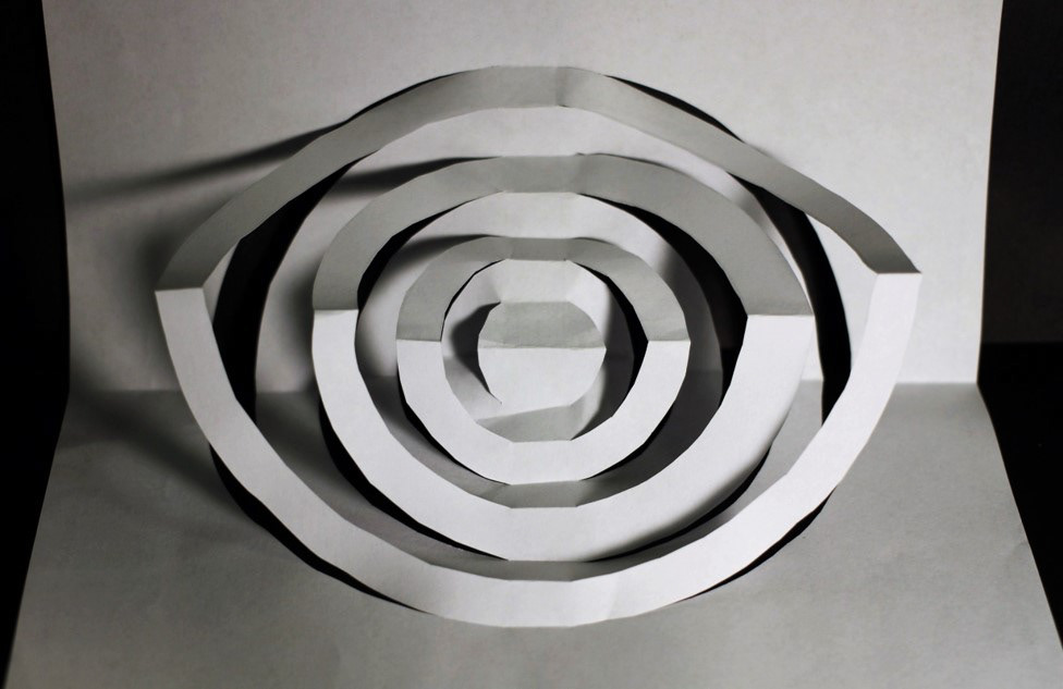
RHYTHM & Repetition
Repetition indicate to one element, such as line, point, area/plane repeated design is mixture of ingredient or shapes repeated in reappear and consistent arrangement. Rhythm is a about of elements repeated, but with abnormality.
This picture shows that I used line and kind of volume to created. the level of scattered wave lines, and The shapes and patterns repeated in a line or overlapping, so the design is in repetition.
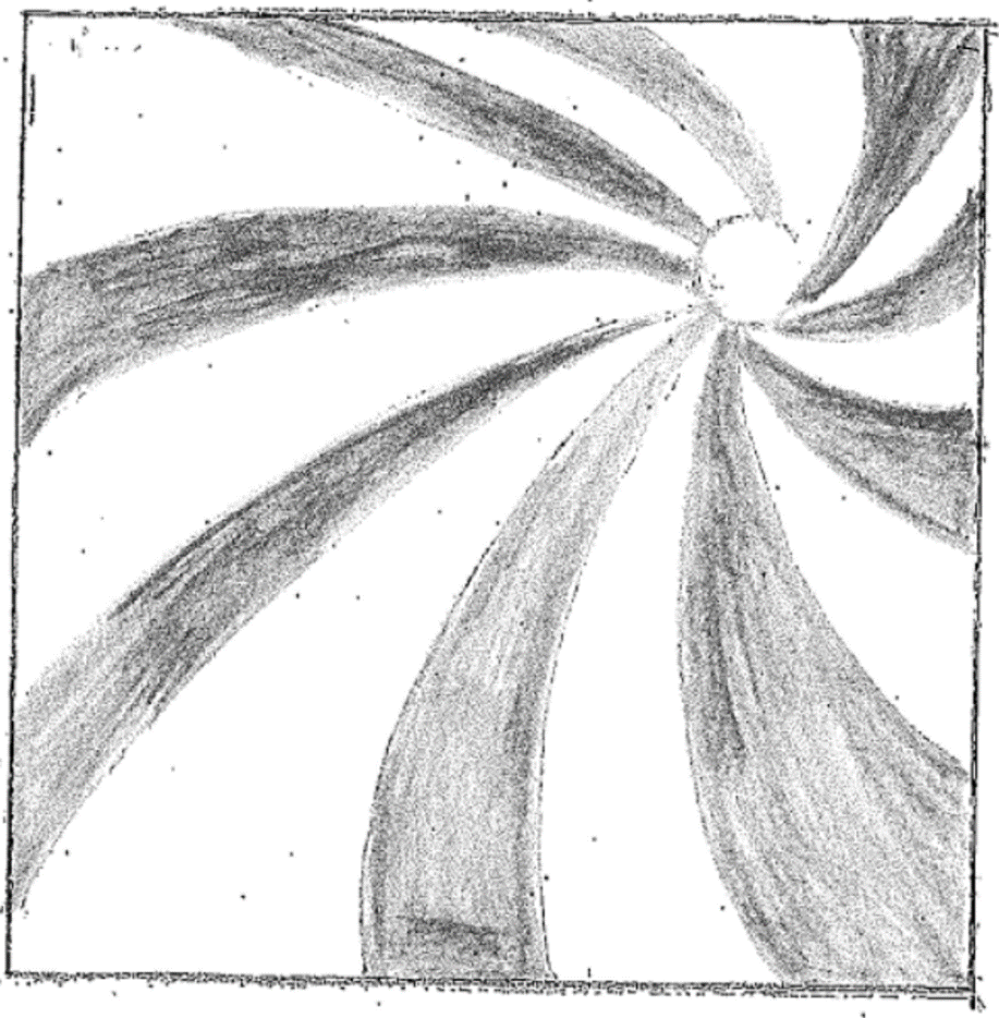
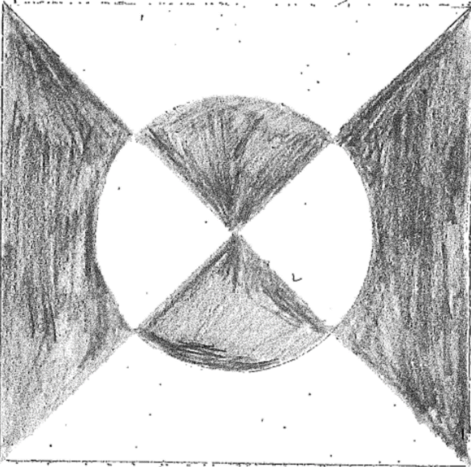
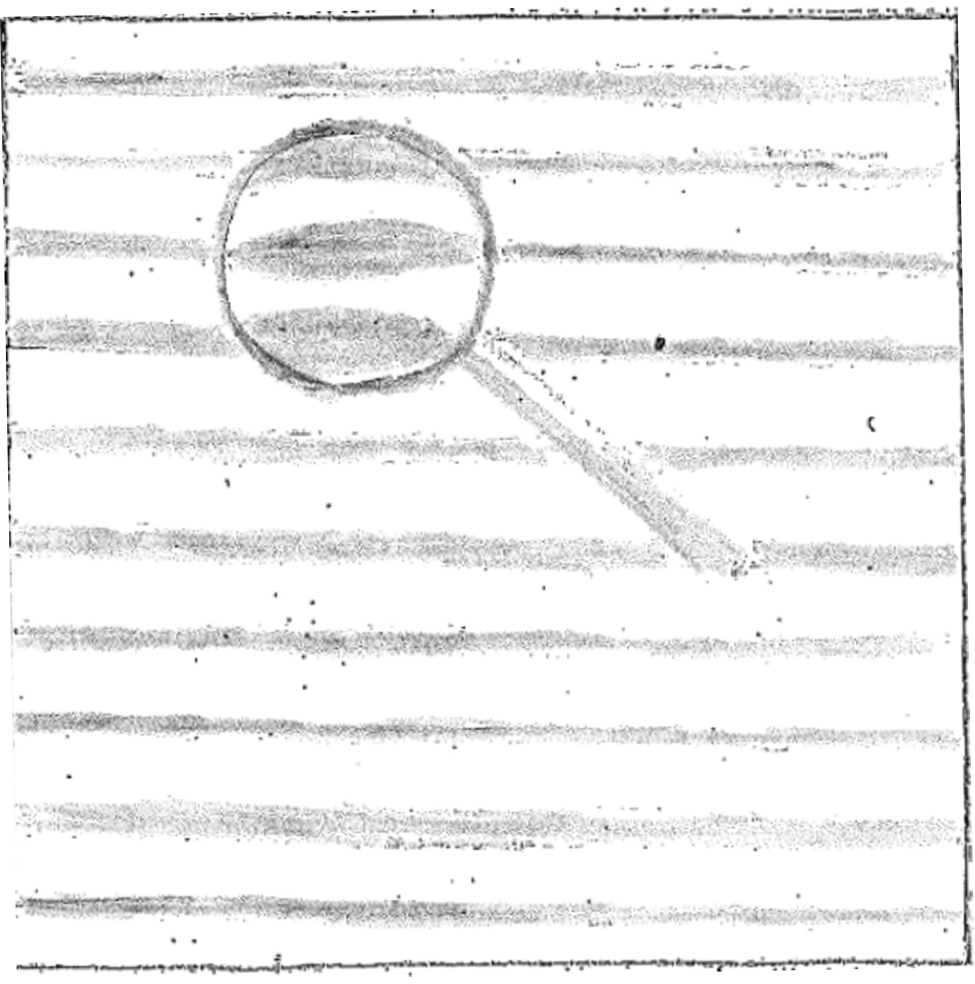
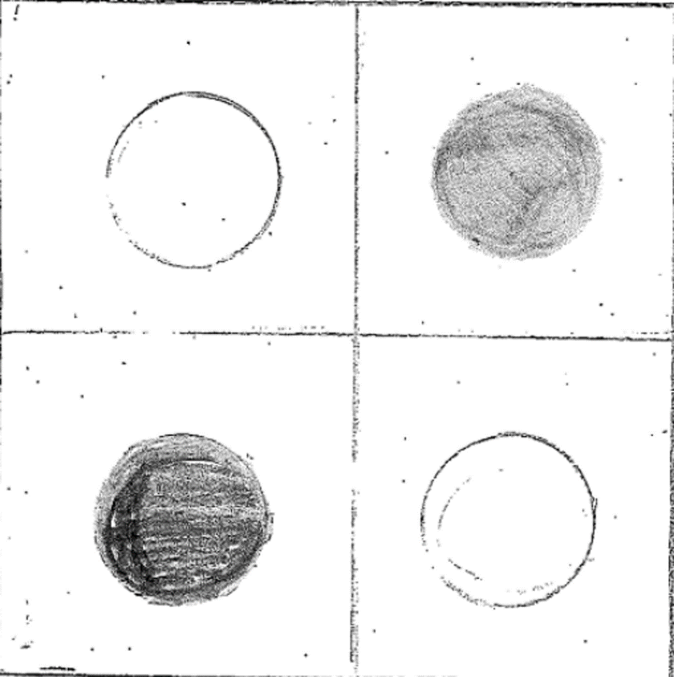
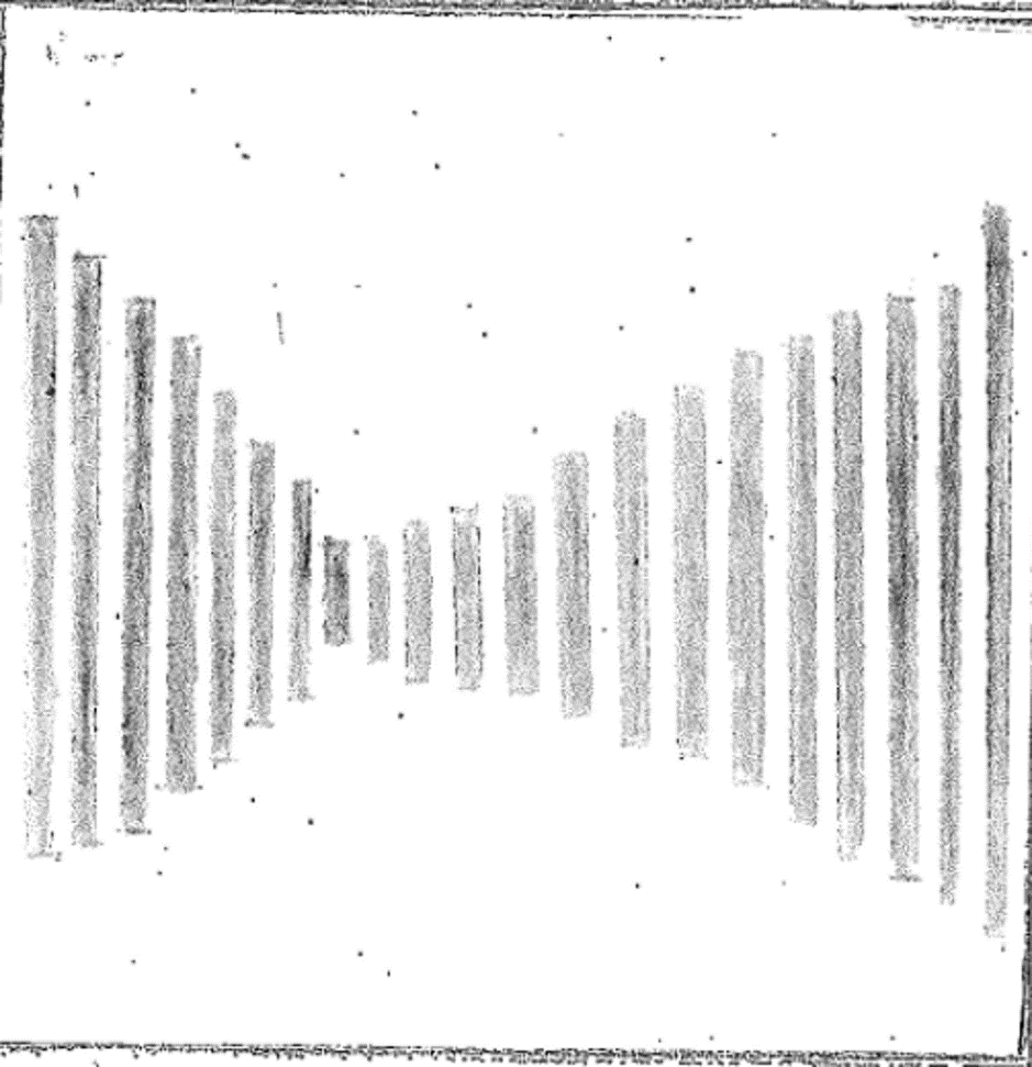
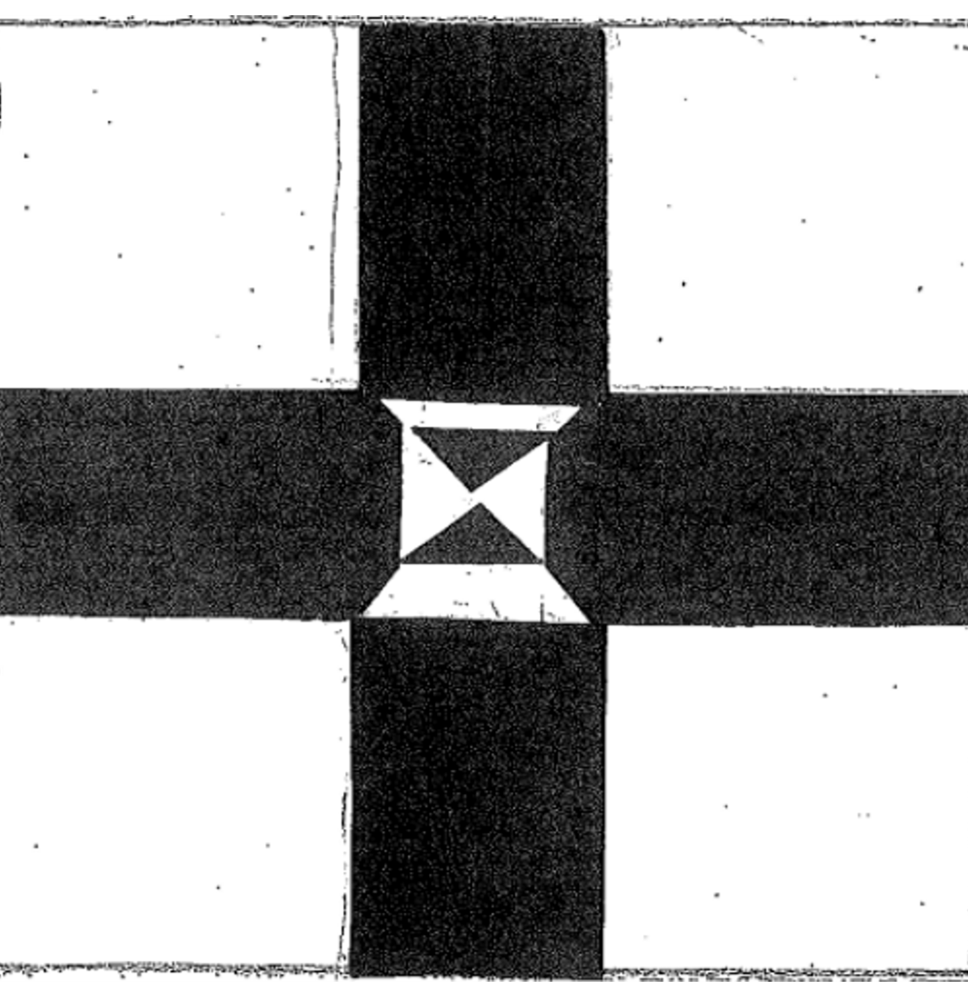
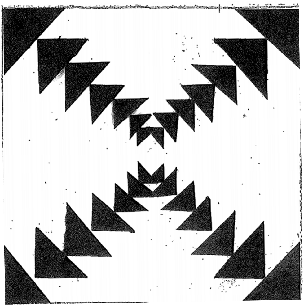
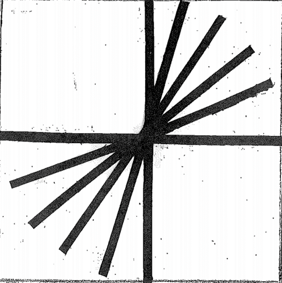
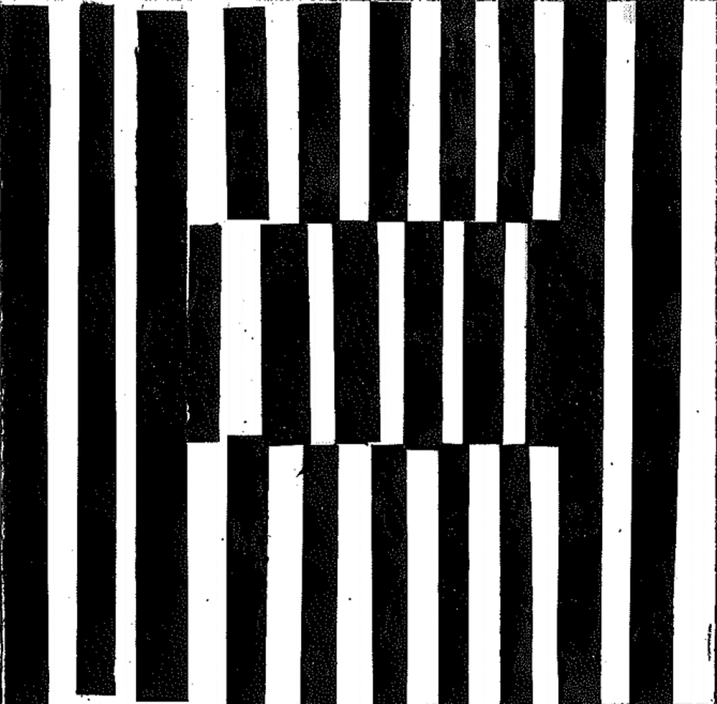
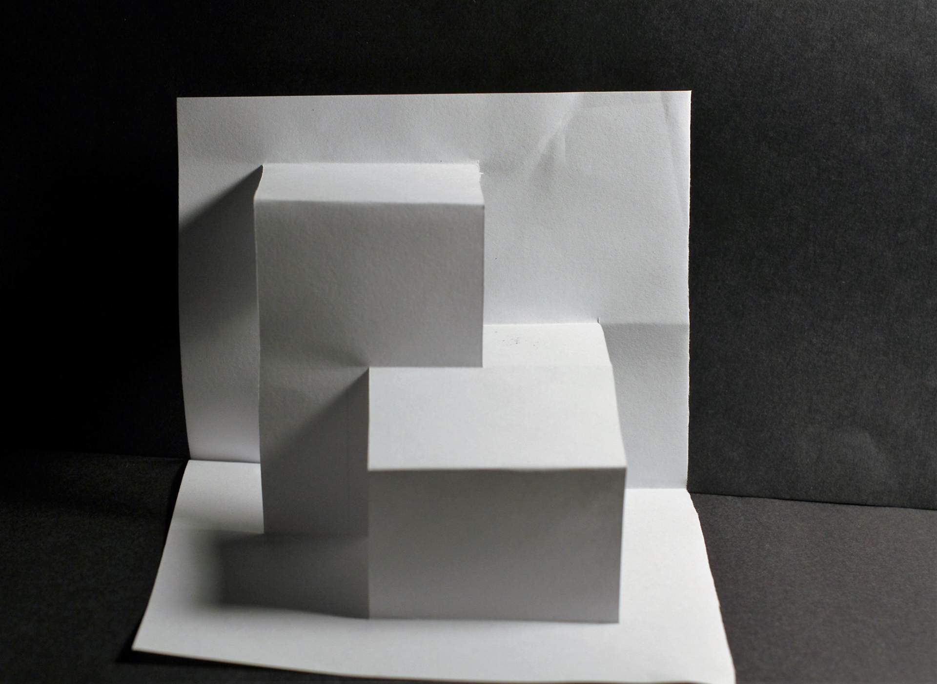
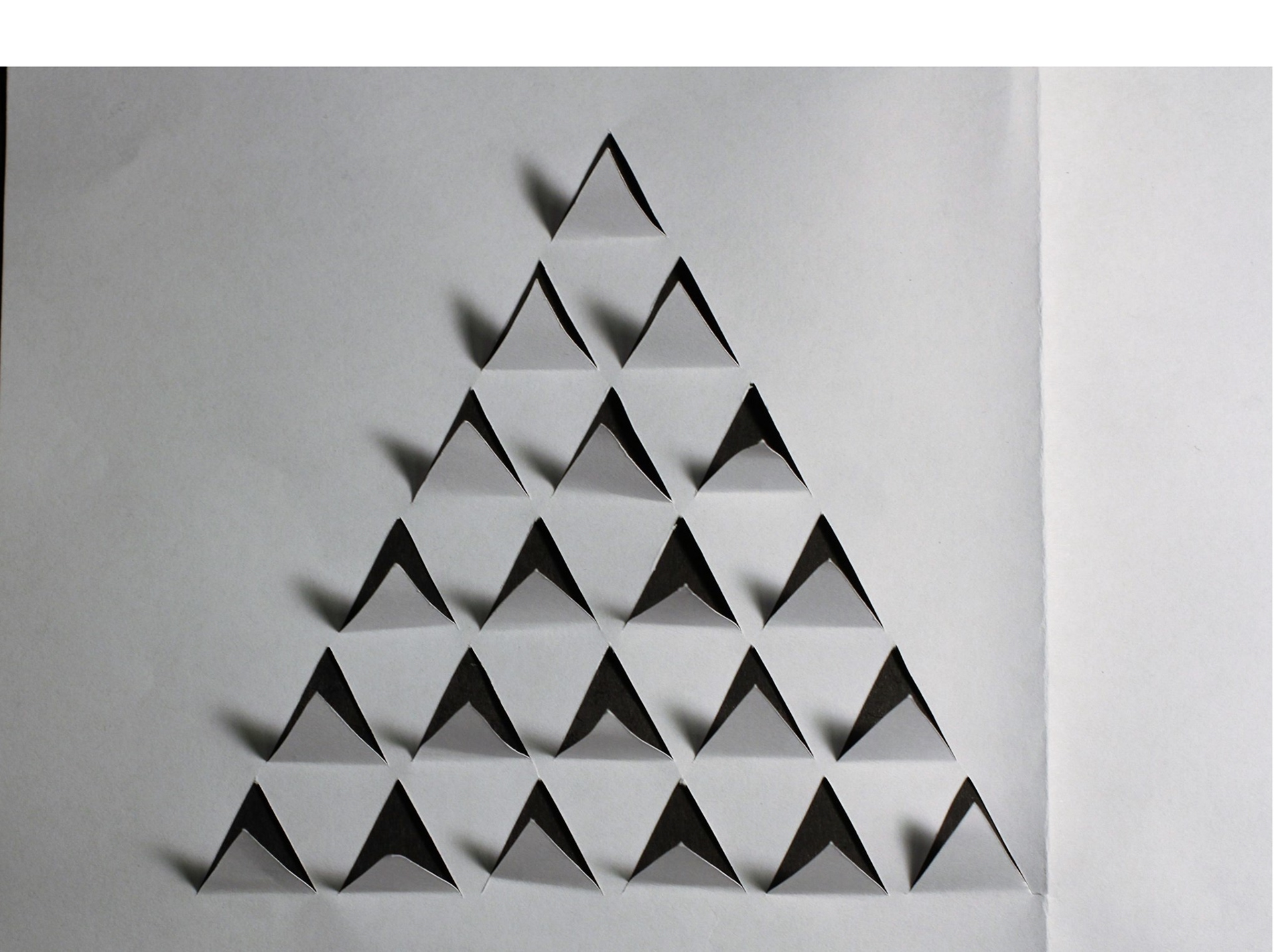
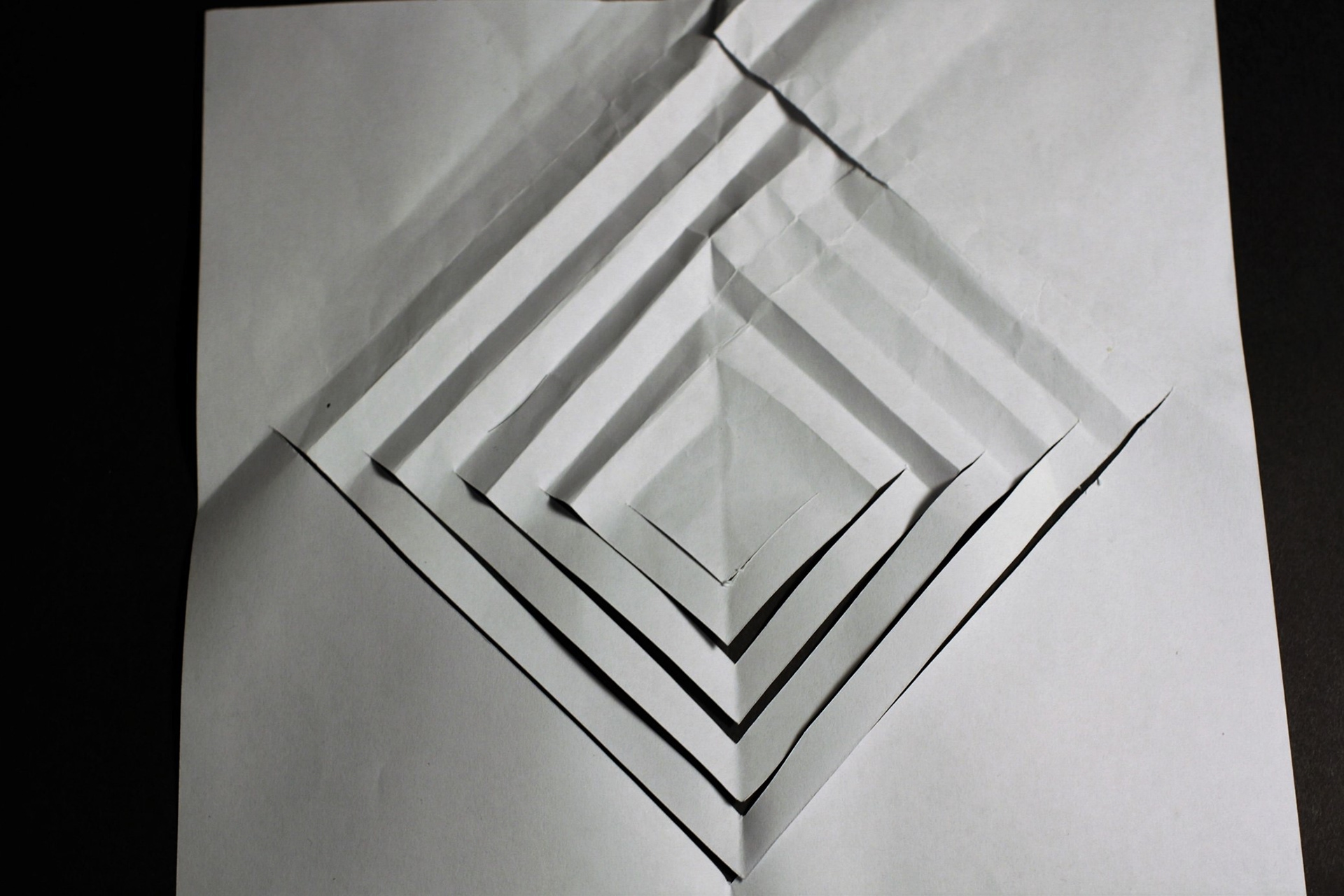
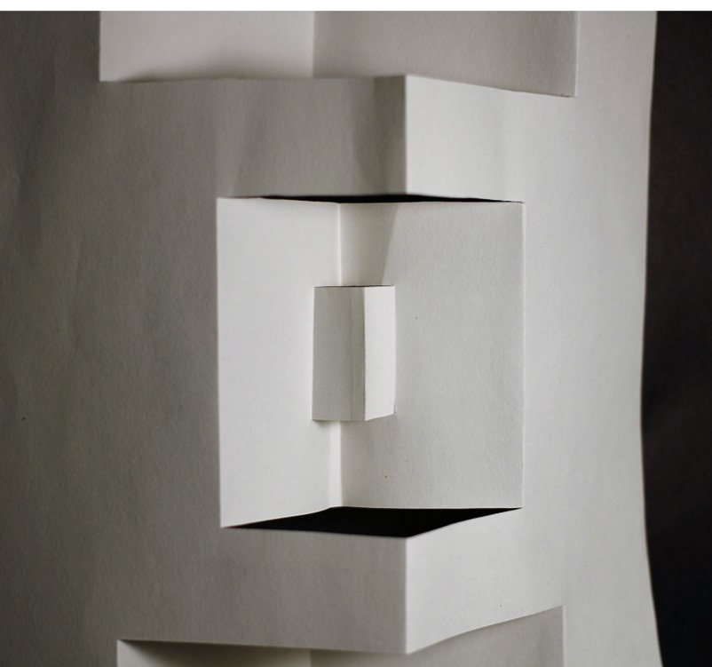
EMPHASIS
Emphasis is a principle of art which let people directly and catch eye`s first. The aim is to highlight something, stand out it and becomes a focal point.
I used line and like positive & negative space to design. The interval line of outstanding , and cross break. The whole pattern stand out. When see this pattern, first see the midpoint.
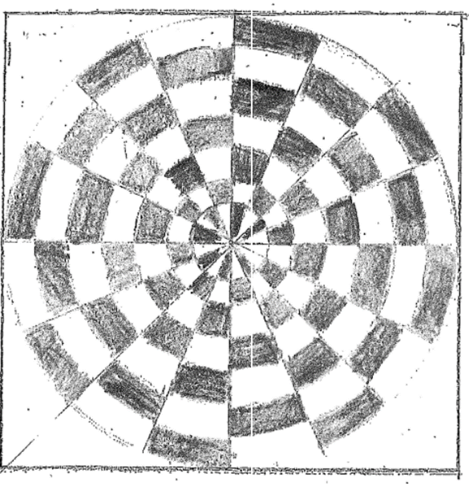
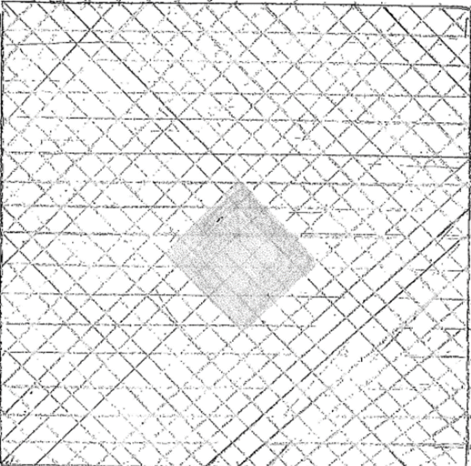
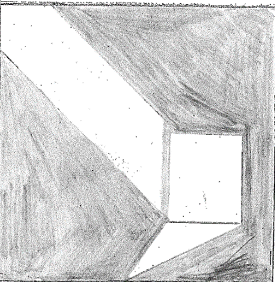
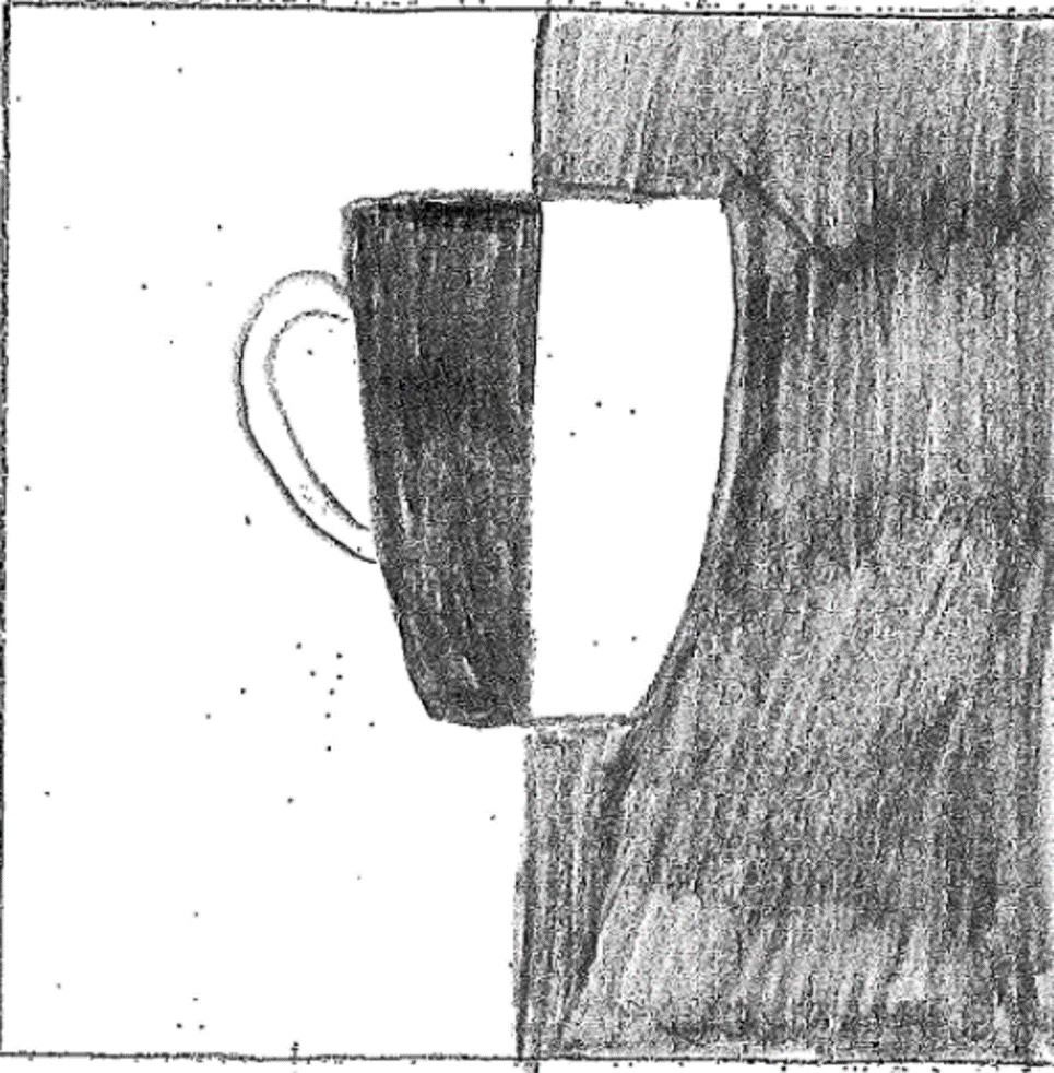
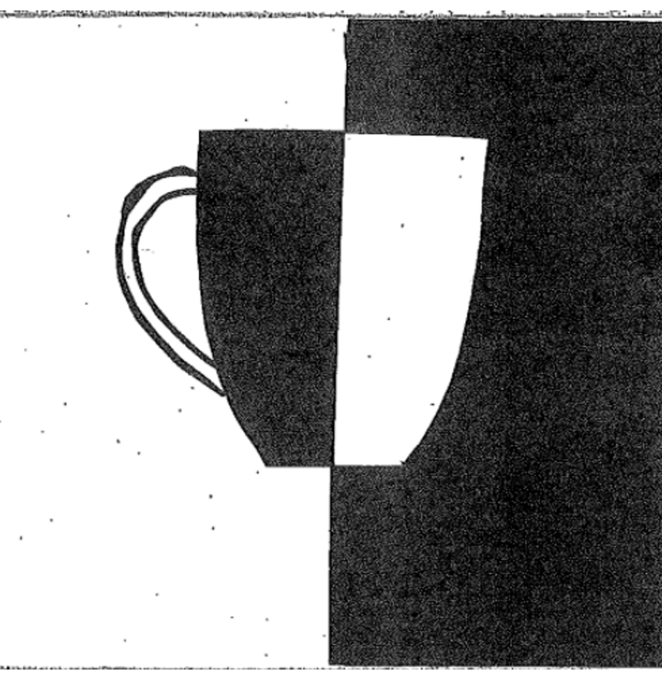
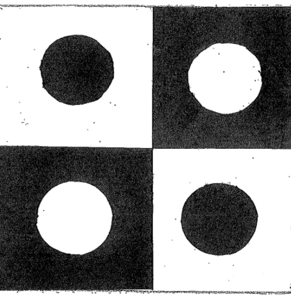
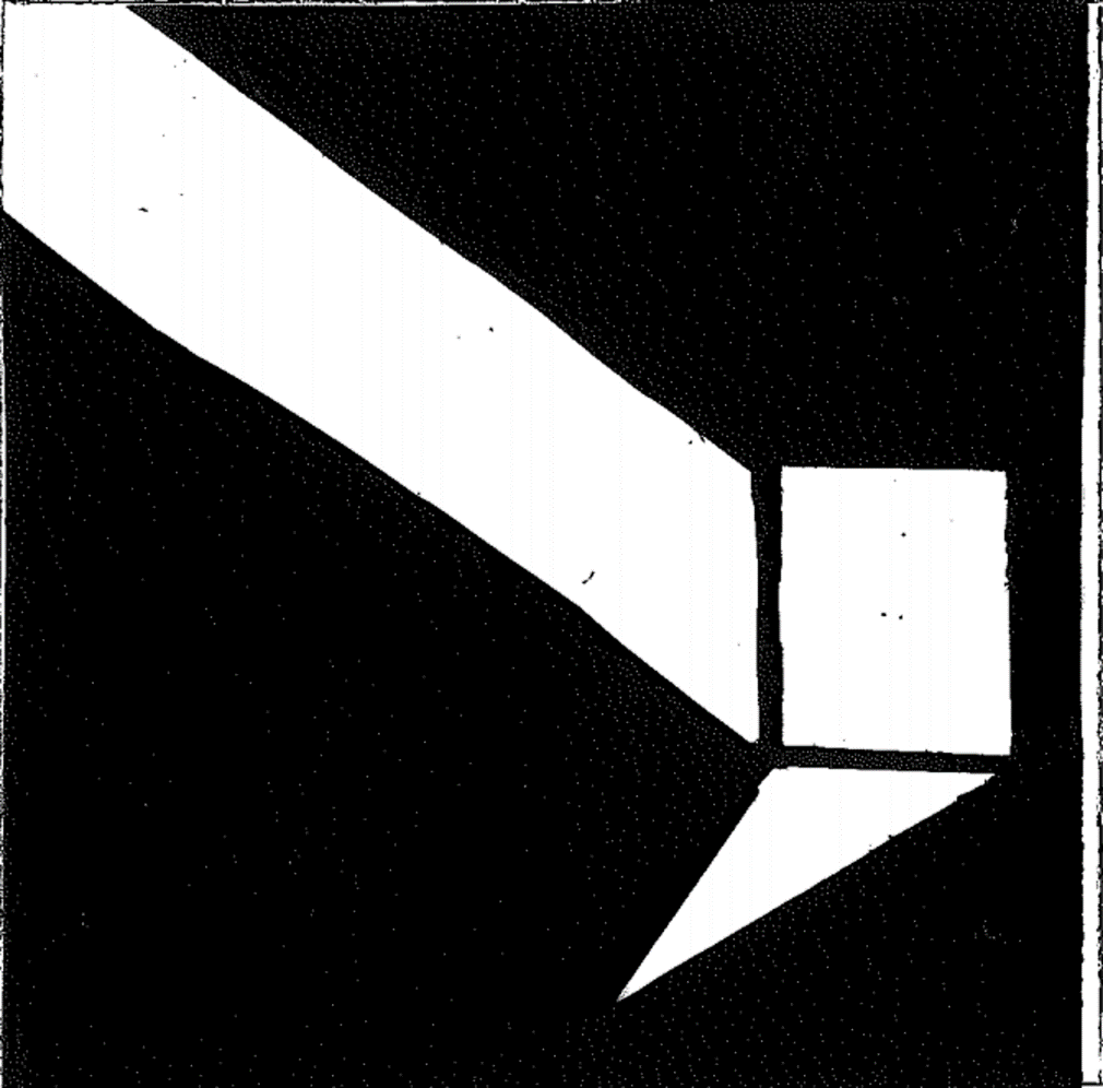
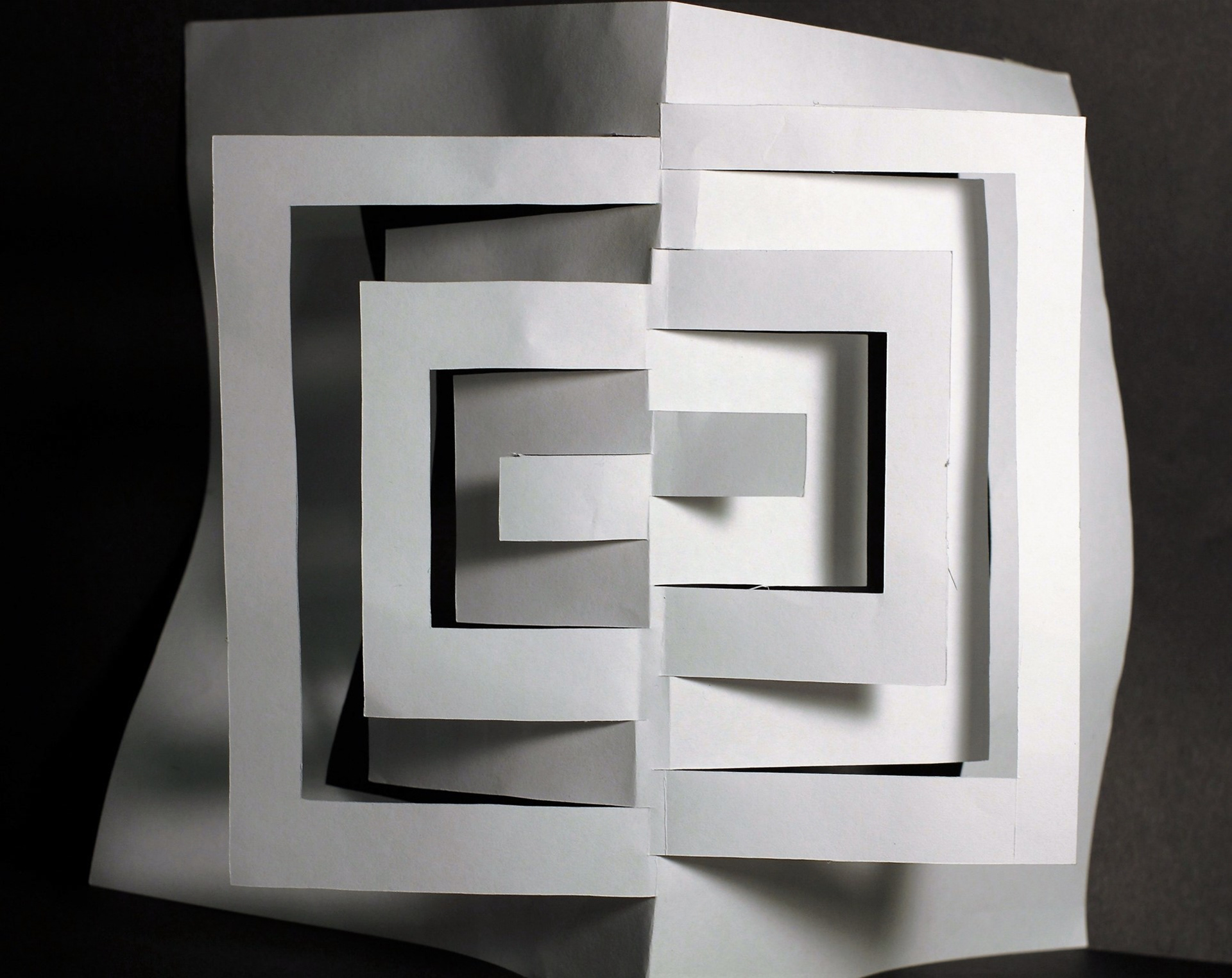
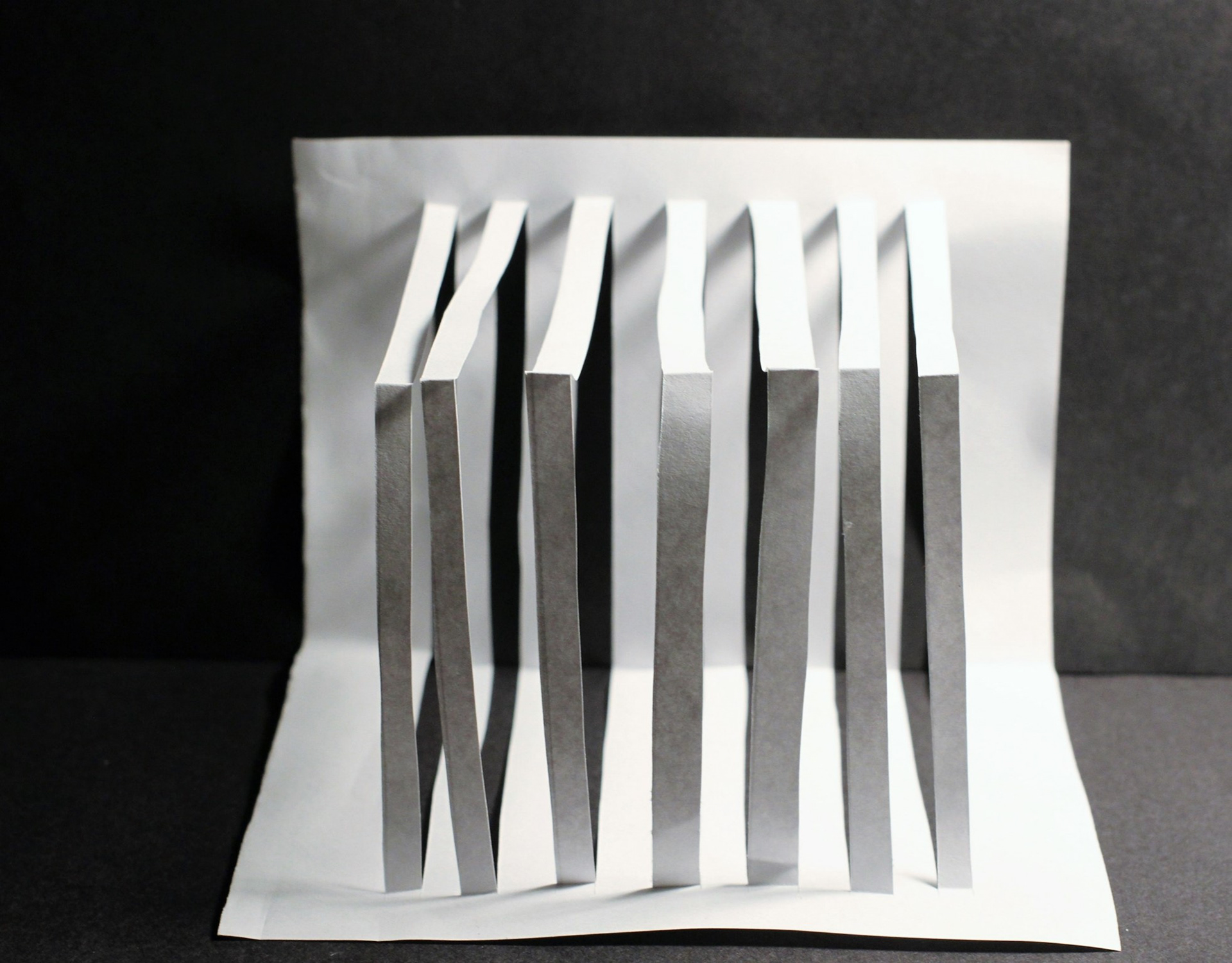
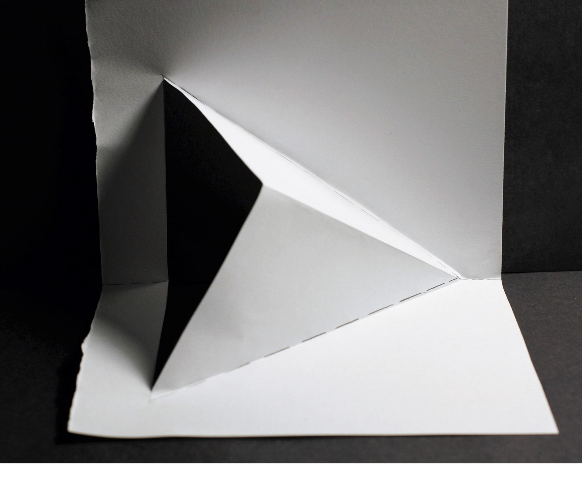
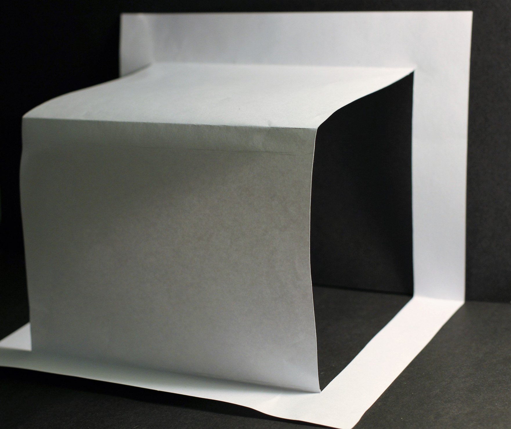
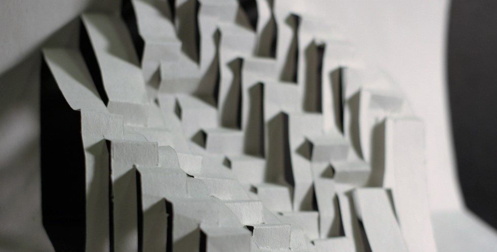
contrast
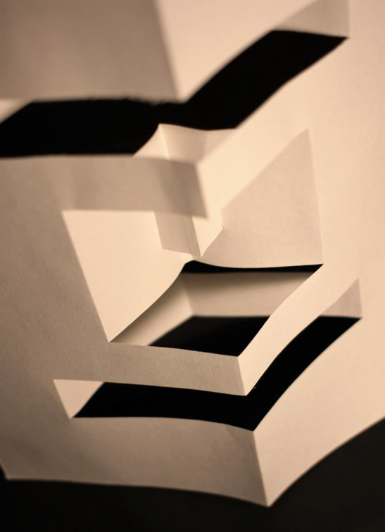
Contrast is like difference, contrast to layout of opposite elements (light vs. dark colors, rough vs. smooth textures, large vs. small shapes, etc.)
In this works, I used line area and positive & negative elements. The one line inside, and next line in outside. the cube in middle. This make contrast. and the middle folded in half. The light exposure from right sides, also create light and shade contrast.
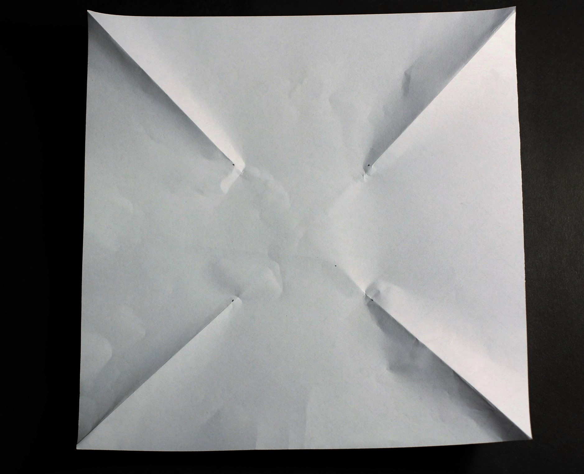
CUTTING PROCESS